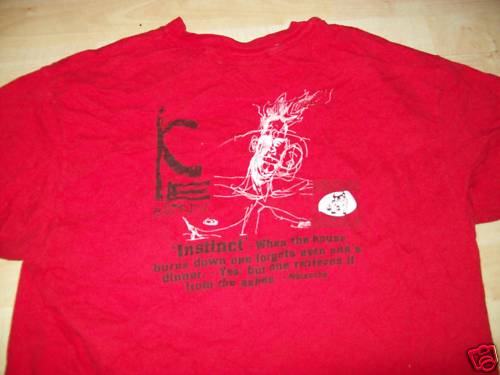
As I posted in the past about Iceburn they are not my shit but a lot of dudes came out of the woodwork to say that they love older Iceburn. This shirt is for all those dudes. A 1991 Iceurn tour shirt. added bonus – only 1 tiny little bulldog!! I will give it to Iceburn- their splattery logo style was ahead of its time. ie. see every bands logo in the 2000s.


I don’t get why you hate on the victory logo so much.
The 2 records on Victory (the 7 inch and full length) I like…reminds me of the midwest emo-core sound that Split Lip and Falling Forward perfected. The later stuff when they got all avant garde and jazzy is not my cup of tea.
Bob, I must say that I really like this shirt. I think that the arm print with 50 bulldogs gets a bit much however.
I am not a fan of the label. I’m not into the majority of their releases or they way they treated a lot of bands. I think the logo is ugly and I hate how the labels name and logos are plastered multiple times all over many many many shirts.
That being said this is a pretty smart looking shirt with a tasteful small logo
Firon and the first 7 inch are great, I owned this longsleeve until I traded it to my roomate for utilities last month.
The victory logo is/was great. I understand the label is shitty now but you can’t take away from the good stuff that came out on it. I just think its lame when every victory shirt you put up it has to have some shit about how awful it Is because of the amount of logos on it.
Bob, can you honestly find a GOOD victory records tee? I’m being serious. I think most bulldogged tees look like shit, and this is coming from a guy who celebrates Earth Crisis, Strife, Snapcase, … But I’m 99% certain that all the shirts from that era AND Victory Records didn’t stand the test of time. But please, prove me wrong. I’m not afraid to admit when I’m wrong.
Its purely a matter of my own personal opinion and doesnt reflect the opinion of all the staff at TTD.com. I think I am most bothered by the fact that it seems like the victory logo/brand is put in the forefront over the band the shirt is actually for. Like when victory logos grace 3 out of 4 sides out of a shirt. Thats why this short sleeve version of this shirt is a breath of fresh air unlike the longsleeve(non tour) version of this shirt which had a victory logo printed no less than SIX times on it!
I dont think I will ever be a fan of a shirt covered in bulldogs but that is good news for all the fans. One less person to compete with over them :)
Dont get me twisted either I love a ton of Victory releases. Warzone, Integrity, Hatebreeds lp, EC, etc…
Older. Newer. All Iceburn.
Ronny Little wrote somewhere that the bulldog perfectly represented the slow boring music that ‘victory’ put out.This was in the earth crisis late 90s heyday mind you.has anything changed?I haven’t been paying attention since BFB left them
Ill take “slow boring” victory shit over rotp any day
I’ve got a great Integrity shirt with the Victory logo on the sleeve only, where the record label logo belongs.
i loves me some iceburn as well. doesn’t matter what era.
i have always thought that the victory bulldog logo is bad on several levels – firstly, the shape/format is a straight bite off the rev logo box, just basically replacing the R/star with the bulldog. no creativity points there. secondly, the bulldog itself is a pretty crappy illustration and the perspective on the dog is kinda awkward. it was fine for some kids label in 1990 that had like, three or so 7″es out, but i can’t believe they’ve run with that for so long without at least modifying it or cleaning it up a bit. imho, on a conceptual level, having a tough bulldog for your record label mascot is just.. kinda silly. paving the way for slow, toughguy, thug etc. all the aspects of HC i never cared for.
i said this in the other iceburn post, but i think the multiple bulldog logos marching down the sleeve are victory’s attempts to mimic other classic HC label shirt designs that have similar layouts. specifically ones from wishingwell, Rev and Schism that have lots of longsleeve logo graphics. can’t fault them for wanting to copy the greats, but it’s overdone and the logos are too big. it does look distracting and crappy when you can’t tell if it’s an iceburn shirt or a victory records logo shirt. plus i don’t like the victory logo in the first place, so.. yeah.