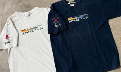
Bootlegs
Archive of Fake VS Real Vintage T-Shirt Tags
It wasn’t long ago that you could easily authenticate a vintage tee using just the tag. There was always a chance the counterfeiter had printed on actual vintage blanks, but the majority of brands didn’t have blanks floating around. So when you were examining a t-shirt with a Giant or Wild Oats tag, you almost automatically knew it was legit.
Needless to say, authenticating was far easier in the olden days.
In the mid-2010s, the real trouble began. Convincing versions of the 80s classics like 3D Emblem and Sneakers, started coming out of Thailand and they were attached to blank t-shirts that were accurately sized and constructed. They even had tri-blend versions (though I doubt the material was actually tri-blend as that tag advertised, counterfeiters aren’t known for their honesty.) But by that time, the market for 80s t-shirts was starting to fade in favor of the 90s, so those fakes didn’t penetrate the market as much as some of us expected, because the counterfeiters quickly realized the real money was in the 1990s.
Fast forward to the 2020s, an era where there are several convincing versions of Giant Tee Jays tags, each new version a little better than the last. And it’s one of the reasons we preach leaning more on a print analysis, rather than the tag when authenticating a vintage t-shirt.
So here’s a comprehensive guide that will be continuously updated as new fakes are identified. If you’ve spotted one in the wild, please get in touch with us.
We’re comparing the real tags versus the fakes because some of these tags are done well enough to fool an old head. It’s not until they are put beside each other that their inaccuracies are highlighted.
Most of these images of fake tags came from various IG accounts, so be careful out there, Instagram is the Wild West when it comes to bootlegs.
Most of the genuine tags came from the Defunkd tag archive, use it, there are instructions here. It was created well before convincing fake tags became a thing.
Tags Indexed (Alphabetical, Click to Jump)
3D Emblem
All Sport
Alstyle (AAA)
Anvil Nicaragua
Backstage Pass
Bay Club
BG
Brockum: Group – Collection – Worldwide – Worldwide (MADE IN CHINA)
Changes
Cronies
Fantasy
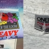
FOTL
GEM
Generic: USA
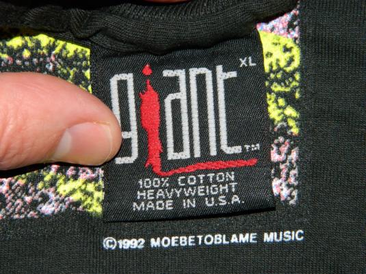
Giant: by Anvil – by Tee Jays – by Tultex – Generic
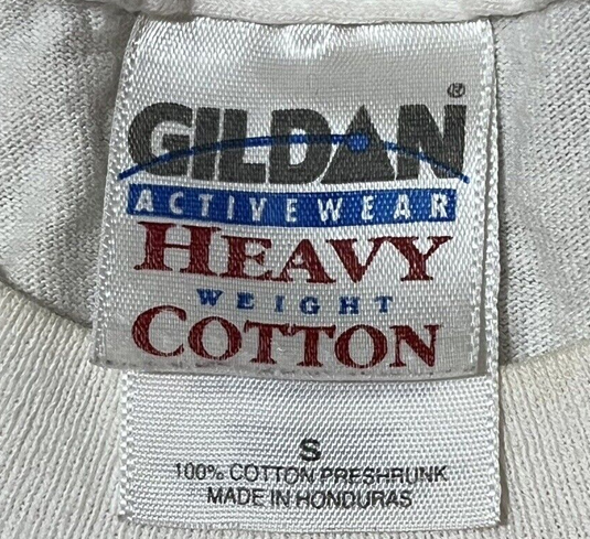
Gildan (3)
Hanes: Blue Bar – Heavyweight – Ultraweight – Heavyweight Double
Harley: Cycles – Clothes
Liquid Blue
Metallica
Oneita Power-T
Resurreccion
Screen Stars Value Weight
Sof Tee by Tee Jays
Spring Ford
Stedman
TULTEX
Wild Oats
Winterland
Fake Giant by Anvil T-Shirt Tags
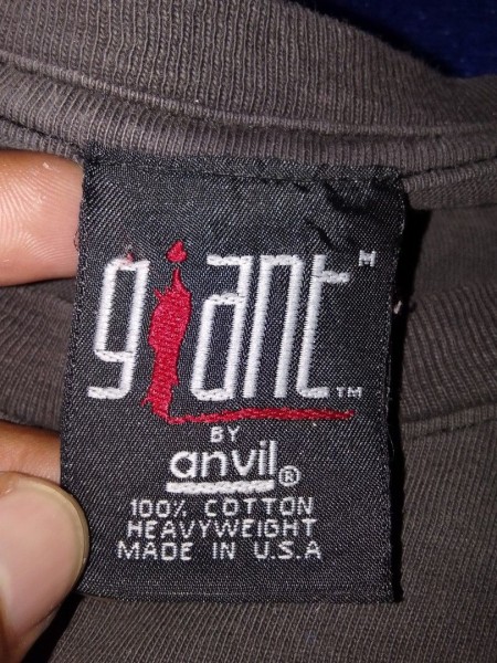
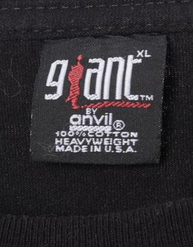
The top one is decent enough to fool someone unaware that there are now fake Giant by Anvil tags. The one above is a travesty.
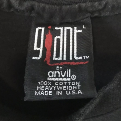
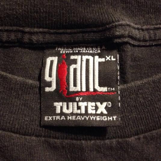
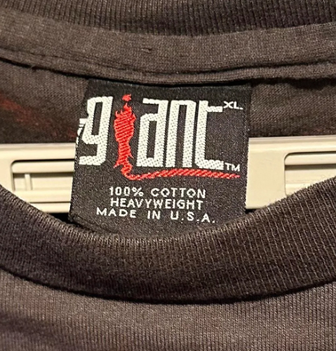
Authentic Vintage Giant by Anvil T-Shirt Tag
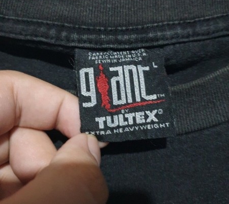
Fake Giant by Tee Jays T-Shirt Tags
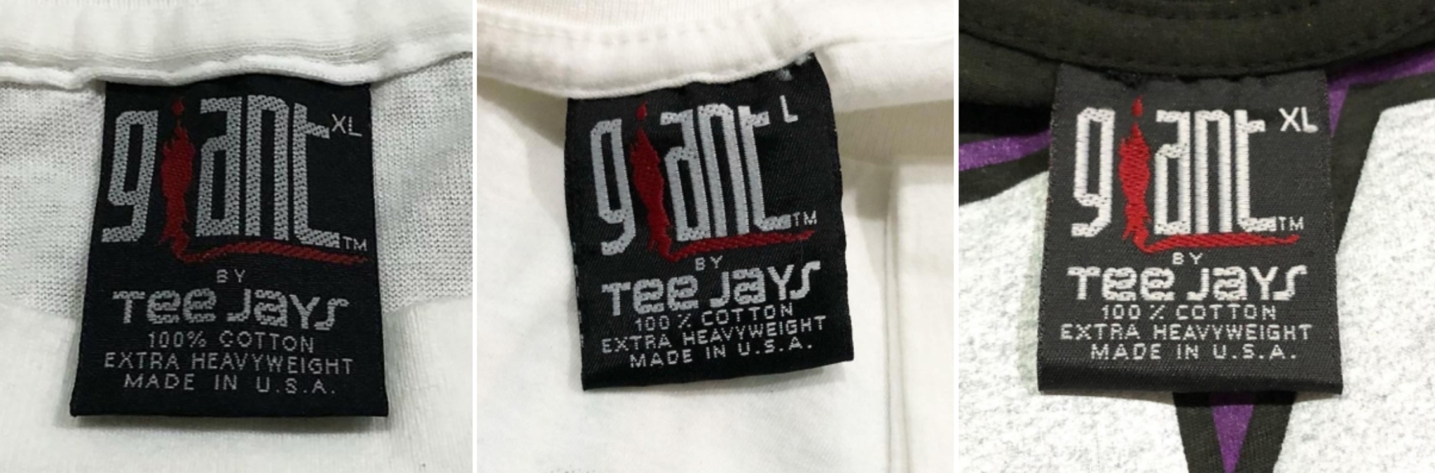
The first version clearly didn’t use enough of a thread count, giving the entire Giant logo a speckled effect. It’s also far too thick.
The second version was an improvement, slightly less speckled, and slightly thinner.
Version three is the best yet, the thread count on the logo is higher but the letters are still too thick. The red detail under the logo is too close to the “ant”.
The type font under Tee Jays is also not sized perfectly.
And then along came newer attempts where they slimmed down the Giant logo:
The above one is still problematic, look at how the S is floating out into outer space. Also, size S may not even exist on Tee Jays tags, so there’s that. Further, the pit to pit on this shirt is 22″, which is not what a size S would be.
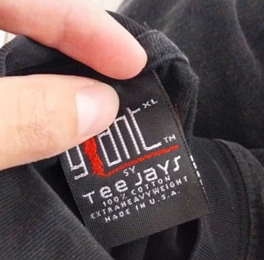
In another disastrous result, all the fonts are anorexic. Plus it says “SY” instead of “BY.” Ooooops. And below we have another hit and miss that seems to be squished vertically.
What can you spot on this newer fake?
You’ll see by comparing them to the real deal.
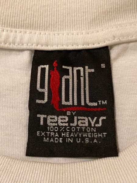
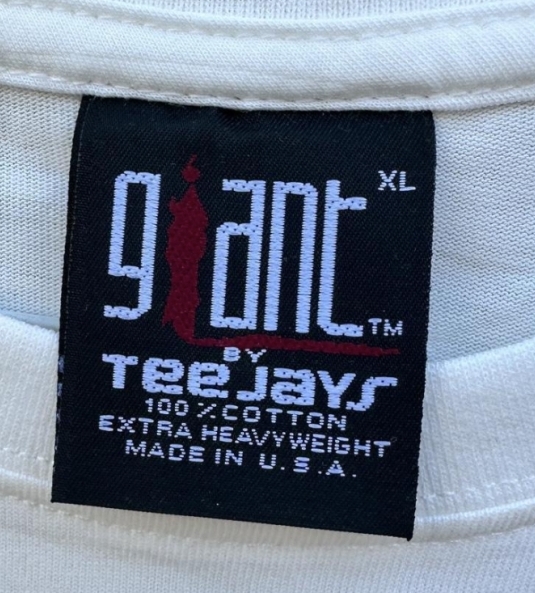
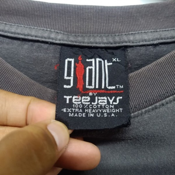
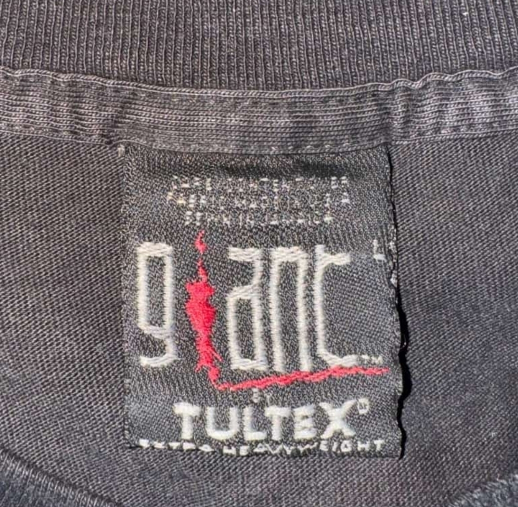
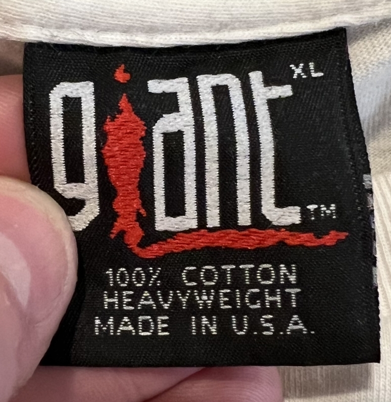
Authentic Vintage Giant by Tee Jays T-Shirt Tag
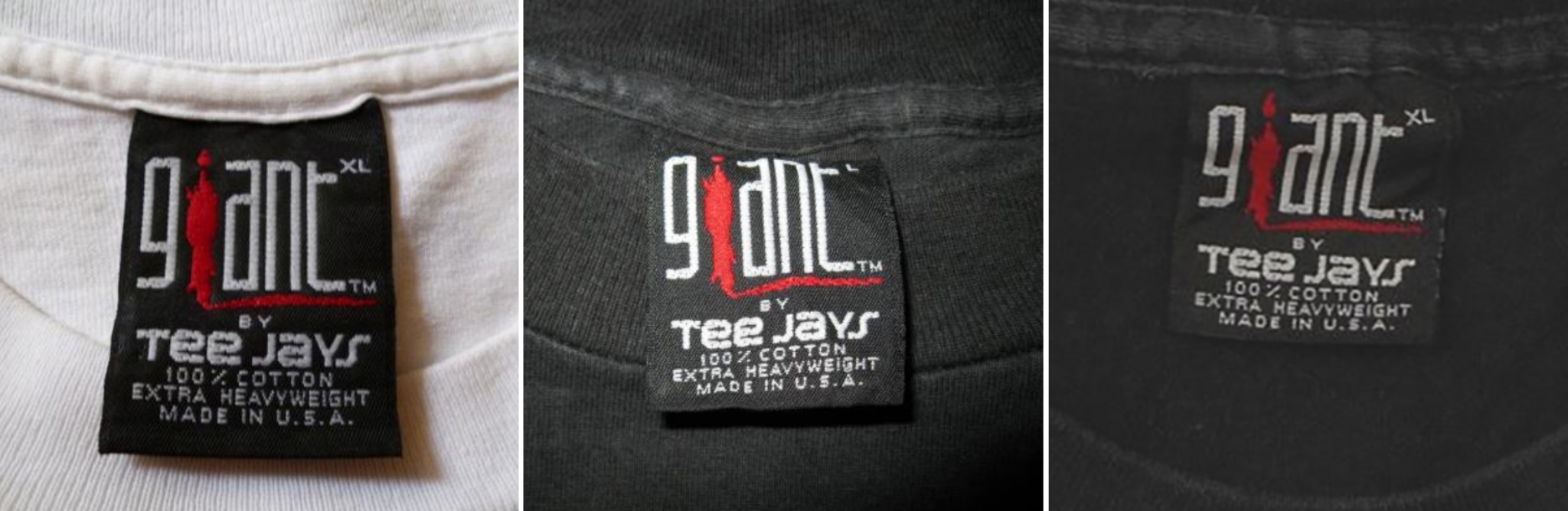
Notably, in the real tags, there is still a slight speckled effect, along the top and bottom of the Giant letters but especially within the “Tee Jays” font.
Interestingly, there are different lengths of legit giant tags if you compare the above.
The real tags above were sourced using the Defunkd vintage tag database where you can see a full gallery of legit Giant tags and just about every tag imaginable. Remember, our tag archive existed before fake tags became convincing, and it was populated by sellers who were vetted for honesty.
BTW, there are authentic tags where the giant logo is thicker, but it’s generally the Giant by Tultex version. It’s almost as though they combined two versions of real tags to make the forgery.
Fake Giant by Tultex T-Shirt Tags
The biggest red flag here is the low thread count in the Giant and Tultex logo, exposing a diagonal line of threads. This fake tag doesn’t appear to be anywhere near as common as the Tee Jays version (for now, anyway.)
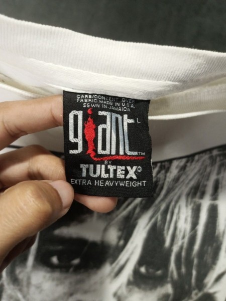
The one above is pretty convincing, but they took some creative liberties with the red flame. The spacing where “BY” sits is cramped. Focus on the “LT” in TULTEX, and you’ll notice that in the true version, they intertwine more.
We shouldn’t need to explain why the one below is fake.
Real Giant by Tultex T-Shirt Tag
3 Fake Generic Giant T-Shirt Tag Variants

In the first two examples the Giant logo is just too damn thick. Size and TM placement not very accurate. The version above it better but the flame is completely out of control.
Real Vintage Generic Giant T-Shirt Tag
Check out our complete brand history of Giant.
Fake Silver Thread Giant T-Shirt Tag
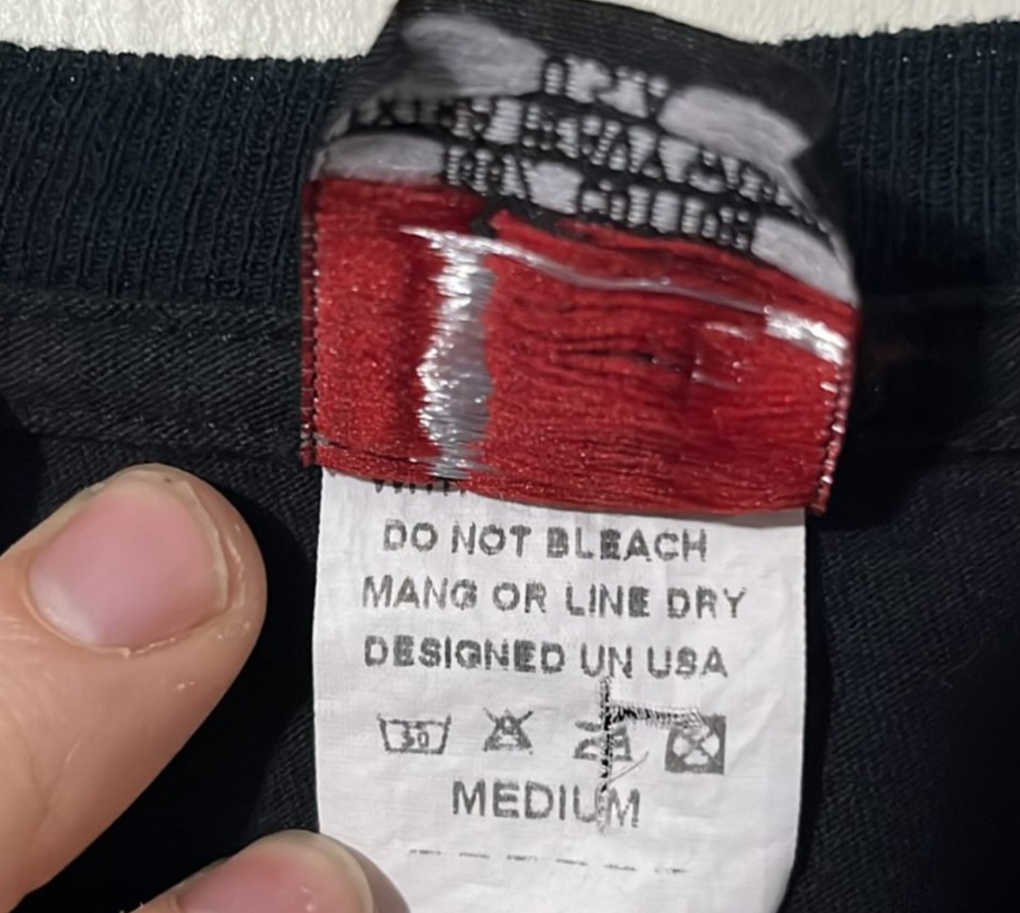
The counterfeiters took lots of liberties with this one, there’s not really one to directly compare it to. Silver thread. Red TM mark. The spelling mistakes on the undertag don’t help much, MANG dry?
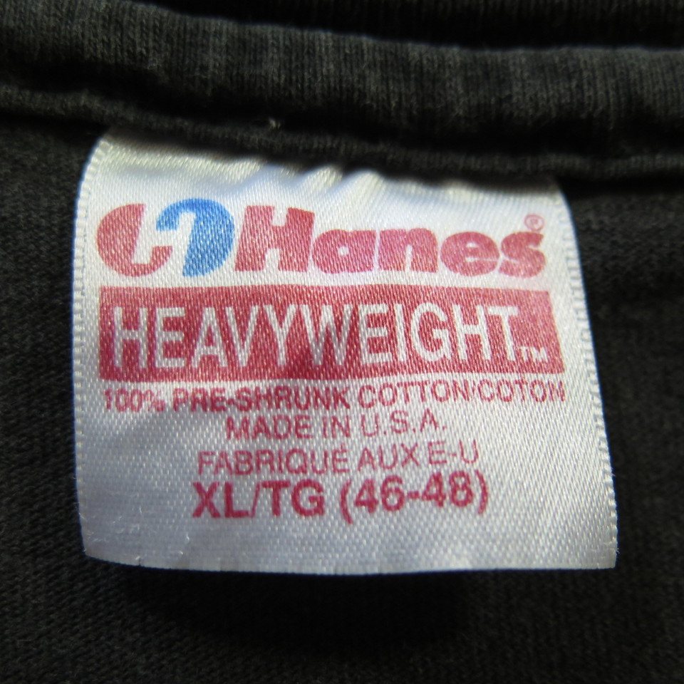
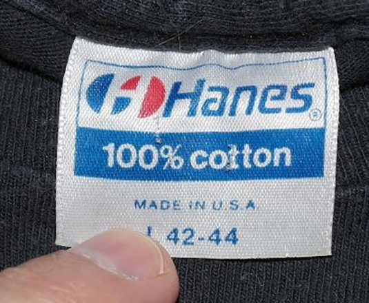
Fake Hanes Heavyweight T-Shirt Tag
Unfortunately, in this red/blue bar era, Hanes didn’t have a strict format for their tags, and even when comparing legit versions, you can find a ton of differences. This particular design is extra guilty of that, so it makes it difficult to ID the fake versions. But the ® symbol above the “S” should most certainly not be backward.
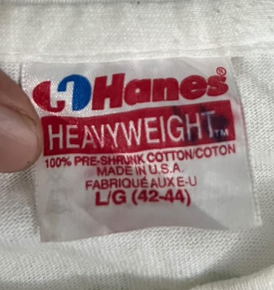
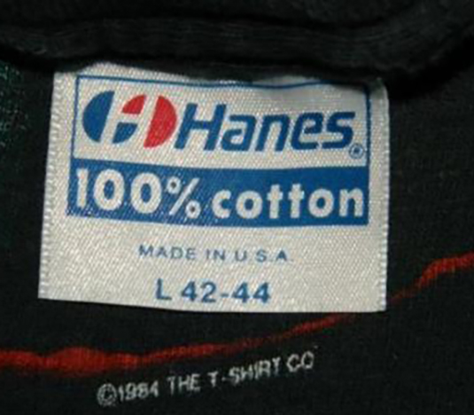
Real Hanes Heavyweight T-Shirt Tag
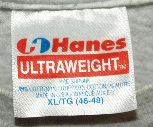
Fake Hanes Ultraweight T-Shirt Tag
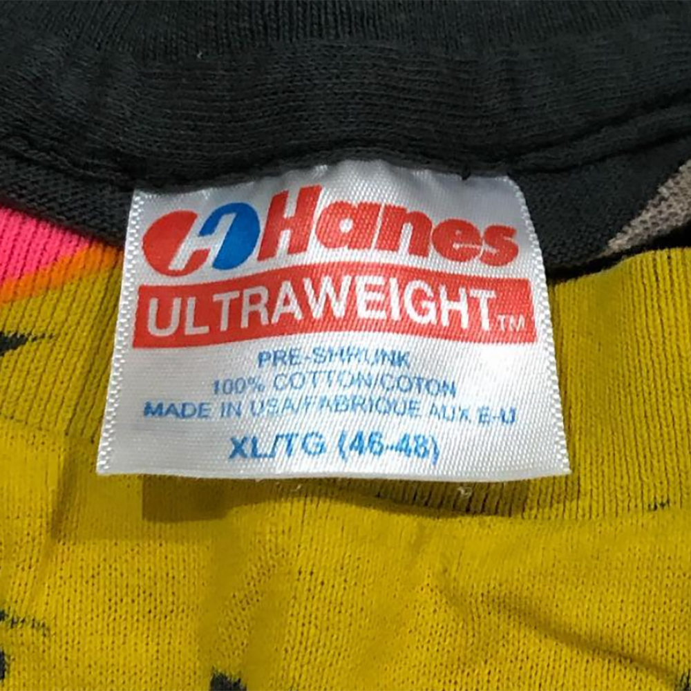
This one is really convincing. And part of the reason for that is that legit Hanes tags from this era and bar design, have a TON of inconsistencies. So make sure when authenticating these Hanes tags with bars on them, that you compare them against a number of legit tags.
The biggest red flag on this one is H, how tall it is. You’ll see this when you compare it with the one below.
Authentic Vintage Hanes Ultraweight T-Shirt Tags

To my earlier point, check out this other legit Hanes Ultraweight and how it differs from the above. The logo isn’t slanted, the spacing is far different. In this era, Hanes clearly didn’t have a brand book or very much consistency with their tags, which complicates the authentication process.
The good news is that the height of their “H” was consistent.
Fake Vintage Hanes Blue Bar T-Shirt Tag
This one leverages the fact that Hanes had no strict design/font selection for their tags in this era. The most obvious flaw is that the Hanes icon is incorrect. The stems of the H should extend fully; there should be no blue/red below/above them.
Below are examples of how legit Hanes bar tags have many variances that could be mistaken for forgeries when compared to each other. Focus on the 100% cotton text in the blue bar and you’ll see there’s a ton of differences that could be assumed to be fake.
Authentic Vintage Hanes Blue Bar T-Shirt Tags
Notice the differences in spacing between the “%” and “c” above and below. The above tag is from 1989 and below 1988.
Then check out the massive font in the blue bar in this example circa 1984.
Fake Hanes Heavyweight Double Tag
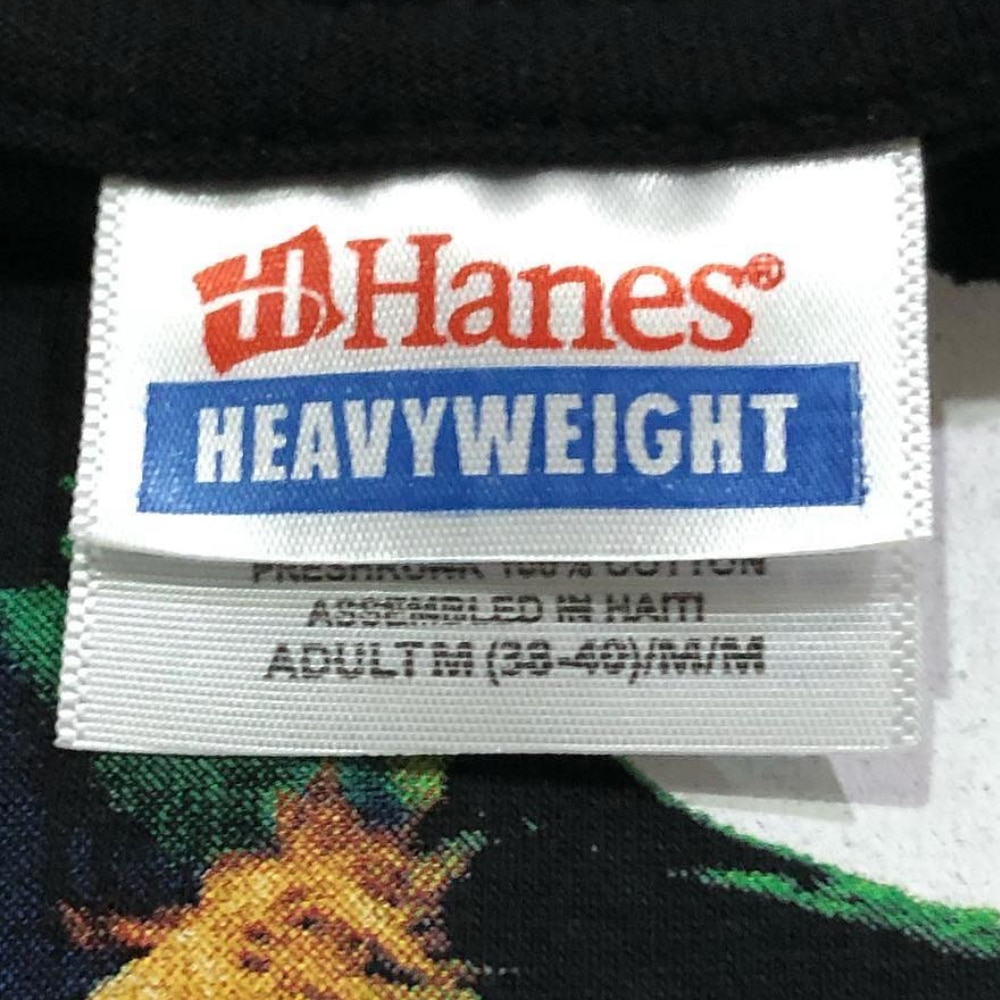
This one is pretty good, especially when not compared directly to a real one. The first issue is that the undertag’s information should be fully visible. Both of the tags on the fake one are too short. Fonts and placement are off.
This tag design has been assembled/made in numerous locations: Mexico, El Salvador, and Nicaragua, but Haiti appears to be the only one that has been faked thus far.
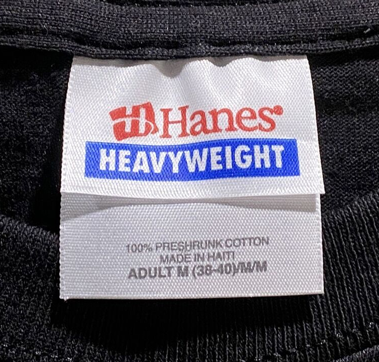
Authentic Hanes Heavyweight Double Tag
Fake Harley Clothes T-Shirt Tag
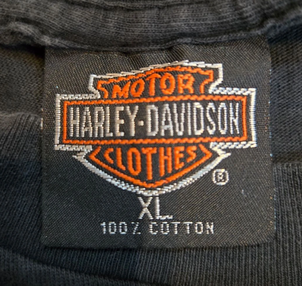
The fake Harley t-shirt tag universe is diverse. Thailand, in particular, has been faking Harley tees for tourists long before the vintage t-shirt explosion. The other problem with identifying fake Harley tees is that even real Harley tees tend to look suspect (like the one below), and there are several oddball versions that straight-up look fake but aren’t. Add in the fact that there are a ton of organic variances between legit tags, and it’s a recipe for authenticity disaster.
Your best bet with Harley t-shirts is to make sure the tags don’t match the fake ones shown here, then scrutinize the print, as the vast majority of Harley t-shirt prints are pretty difficult to knock off convincingly, e.g., 3D Emblem.
When comparing the above to the real one below, you can see the HARLEY font is way off. It’s too tall, it’s thinner. There’s also not as much of a peak above the T in “Motor.” “Clothes” has much more breathing room, and several other red flags are clear.
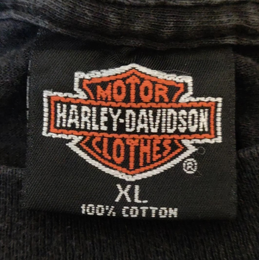
Authentic Harley Clothes T-Shirt Tag
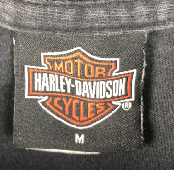
Fake Harley Cycles T-Shirt Tag
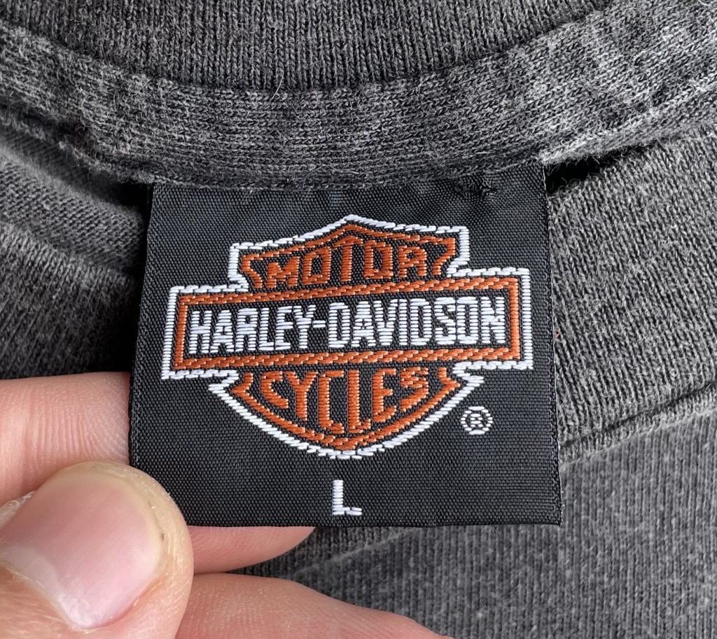
Authentic Harley Davidson Cycles T-Shirt Tag
Fake Cronies T-Shirt Tag
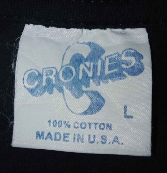
Not going to lie, this one is good. It’s pretty hard to find much wrong with the actual logo, but the goof happens with the fonts below, the weight of the font and the kerning. Notably, legit Cronies tags are another tag with a ton of variances; black and white vs color, it’s also a tag that is often sewn in, legitimately, so it can be tricky to authenticate.
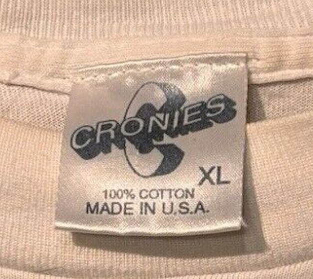
Authentic Cronies T-Shirt Tag
Fake BG T-Shirt Tag
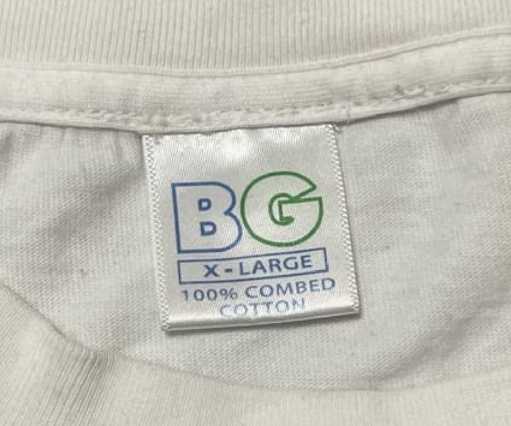
A growing trend among counterfeiters is to exploit lesser-seen tags; there’s no better example than BG. BG also has a ton of variance between legit tags, which also makes it tricky to determine what’s what. The red flag here is the finishing trim on the right and left sides of the tag.
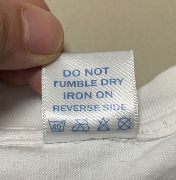
On this particular one, the back of the tag reads “rumble Dry” instead of “Tumble Dry” but there’s a good chance the brand may have used this language at some point. In 2013, this BG tag was uploaded to our archive, and it appears to read rumble on the back, so we can’t assume that any BG tag with “rumble” is fake – as it seems extremely unlikely that fake BG tags existed 12 years ago, especially given the reputation and provenance of the user who posted it.
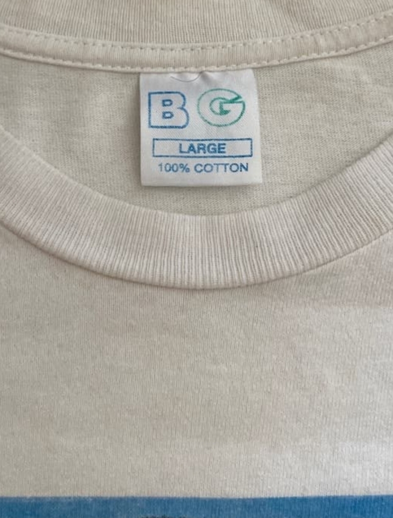
Authentic BG T-Shirt Tag
Fake Wild Oats T-Shirt Tag
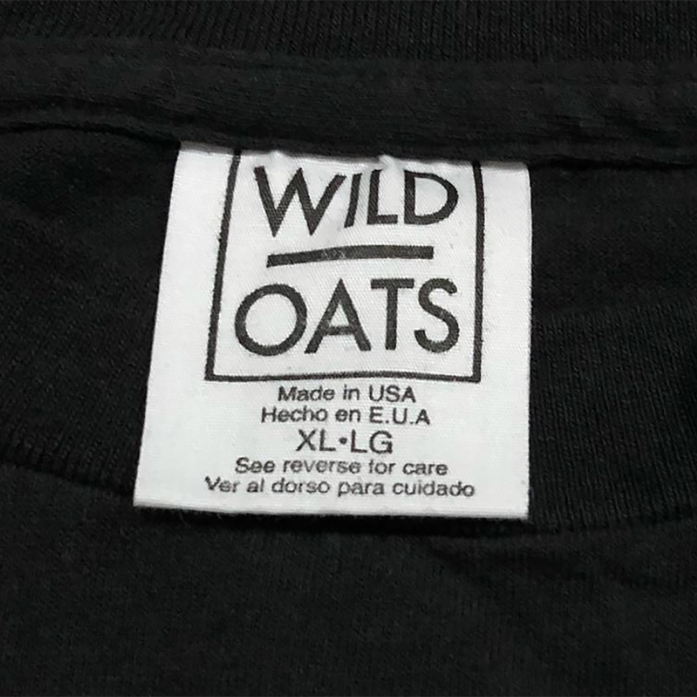
One of the dead giveaways for this tag is the fact that the border above it is hidden under the seam. This means they didn’t get the size of the tag correct. Be careful though, because I’ve also seen legit Wild Oats tags that have the same issue, which was likely a manufacturing error. Another error, “LG” beside XL is a typo. It should be “TG” for “Tres Grande.” Also compare the thickness of the fonts, thickness, and spacing. Take a look at the spacing between XL and LG.
Authentic Vintage Wild Oats T-Shirt Tag
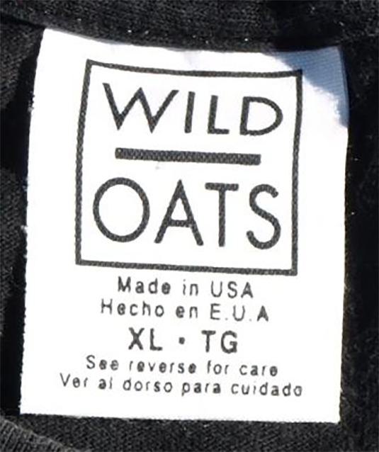
There are several versions of Wild Oats tags, take a look at our historical tag guide as well as our archive of them.
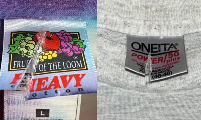
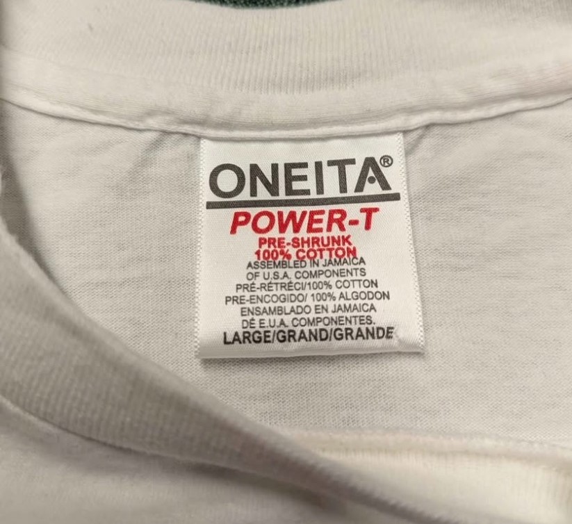
Fake Oneita Power-T T-Shirt Tags
You don’t have to be particularly brilliant to realize the differences here. We’ll never know why they targeted one of the more text-heavy tags and made it black & white. But then along came the color version, with it’s far too generous logo kerning.
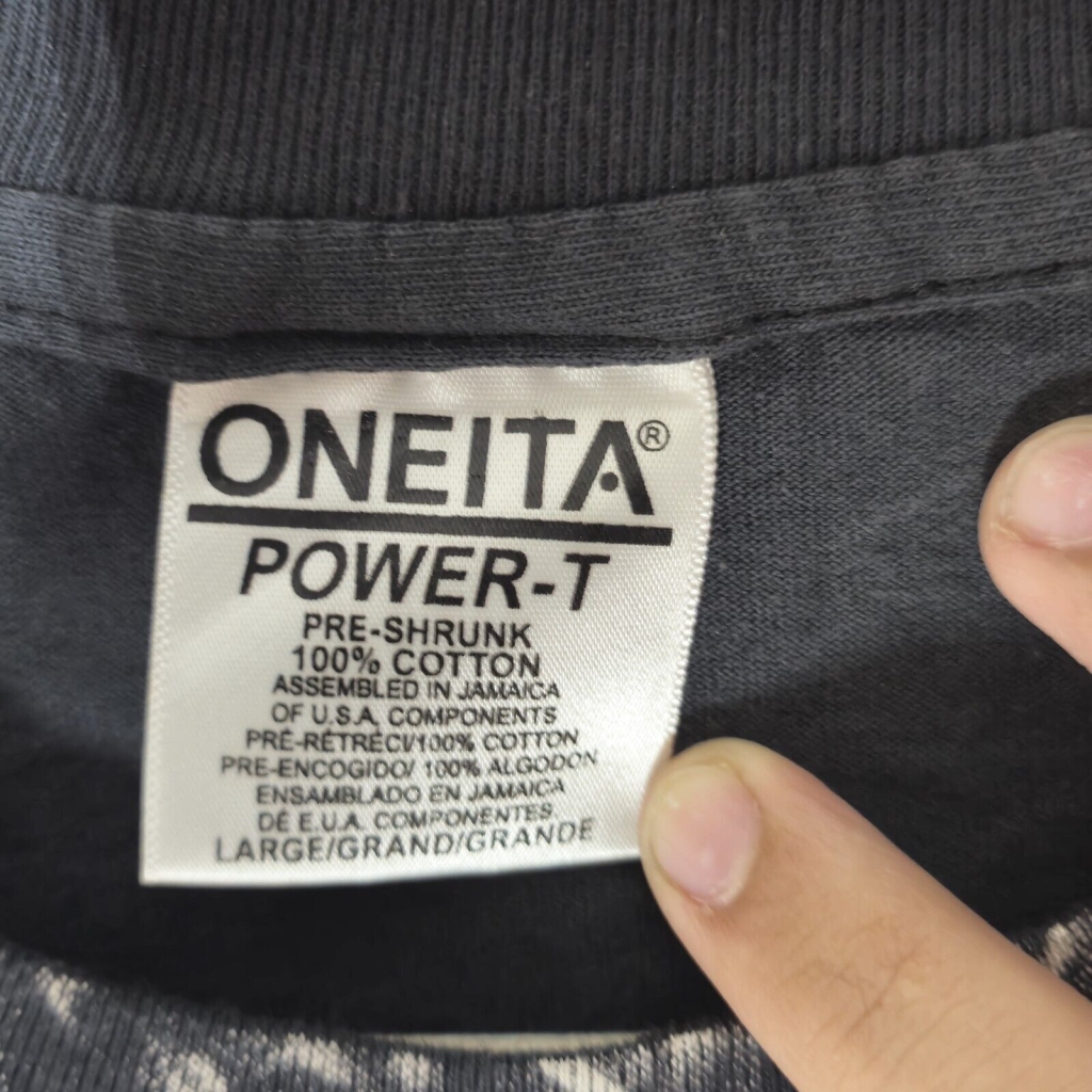
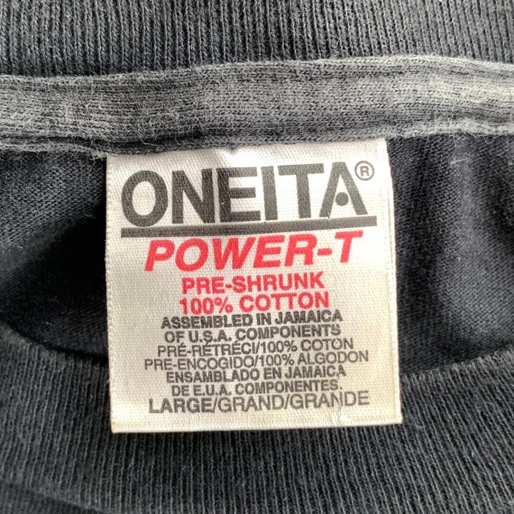
Authentic Oneita Power-T T-Shirt Tag
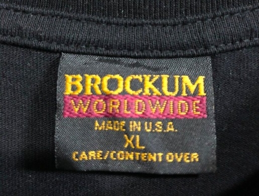
Fake Brockum World Wide T-Shirt Tags
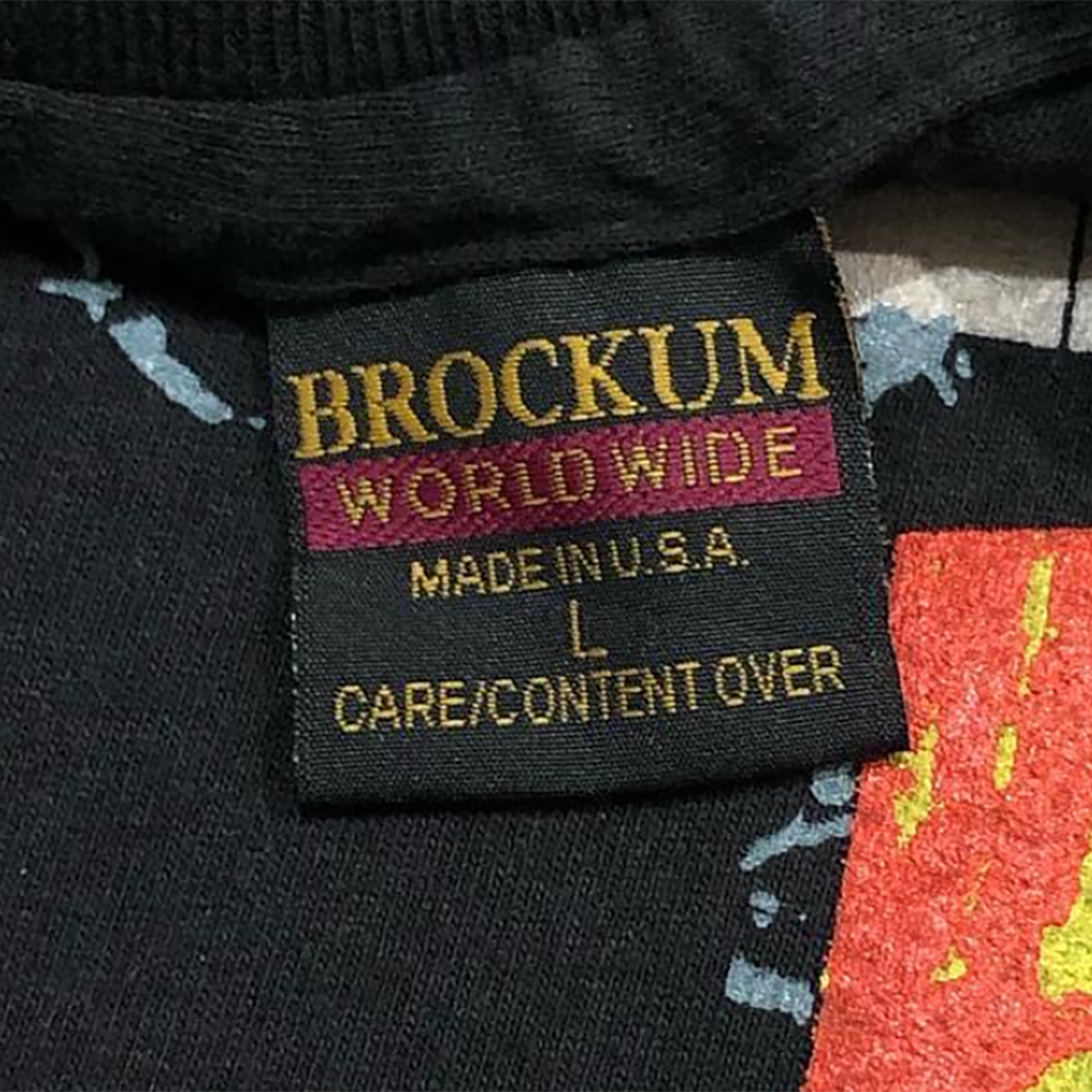
Not hard to spot the differences here. The Brockum font looks stretched, it’s too tall.
It looks like “WORLD WIDE” with a space rather than “WORLDWIDE.”
The font below the bar is not correct.
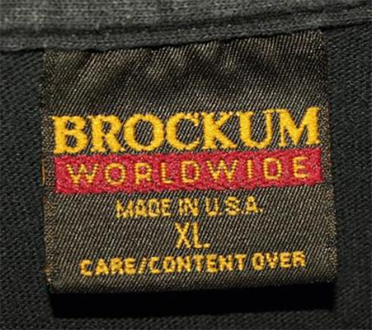
As of September 2024, a new, far more convincing fake has emerged.
The red flags here – the Brockum logo is sitting too close to the rectangle. The rectangle itself is too tall, as is the font inside. The “L” doesn’t have a missing segment.
Follow this link for more examples of genuine Brockum Worldwide tags.
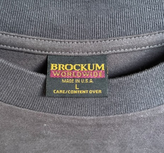
Authentic Brockum Worldwide T-Shirt Tag
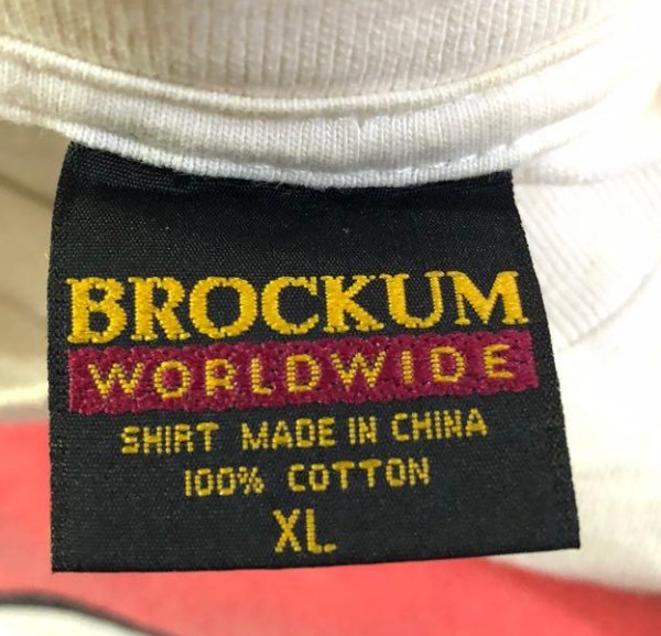
Fake Brockum Worldwide (MIC) T-Shirt Tags
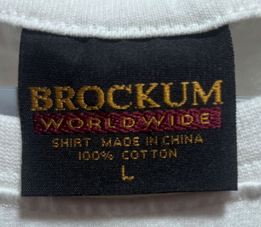
Even the authentic versions of this (below) were suspected of being fake because of the “SHIRT MADE IN CHINA” text. We first examined them in full detail here. Now, counterfeiters are leveraging the fact that they have been cleared and releasing fake versions to catch us off guard. The problem is, it’s a terrible job. But the one below is far better and more convincing.
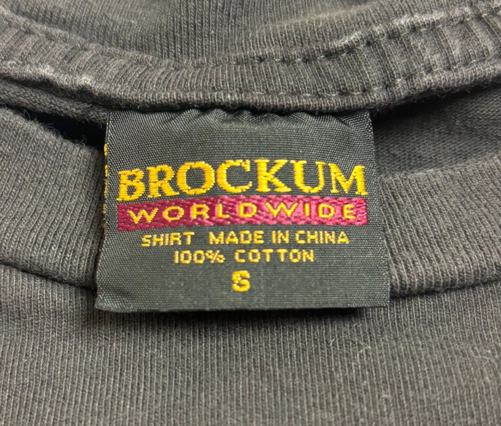
Authentic Brockum Worldwide (MIC) T-Shirt Tag
Fake Fruit of the Loom T-Shirt Tag
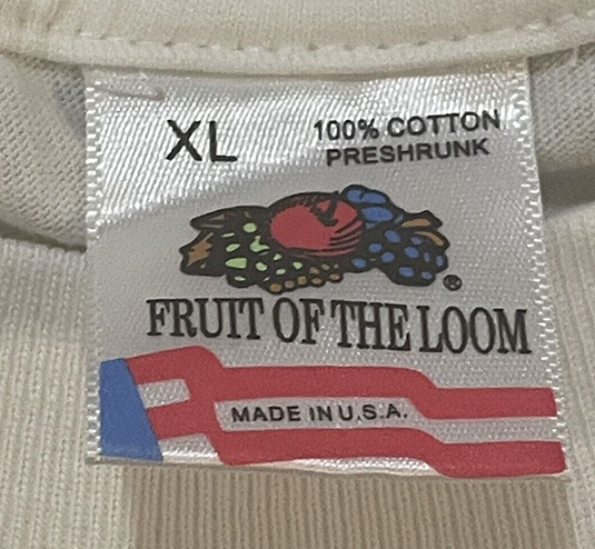
For this one, focus on the fruit. The finer details are gone. The shading doesn’t exist. Not only that, they made the grapes purple so they wouldn’t have to use an additional color.
Authentic Fruit of the Loom T-Shirt Tag
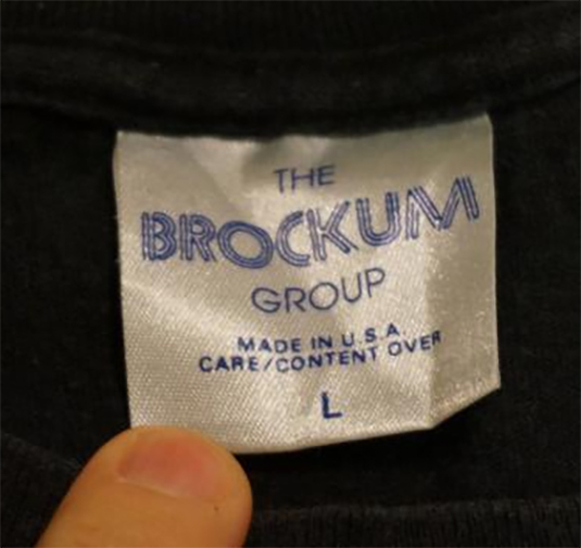
Fake The Brockum Group T-Shirt Tag
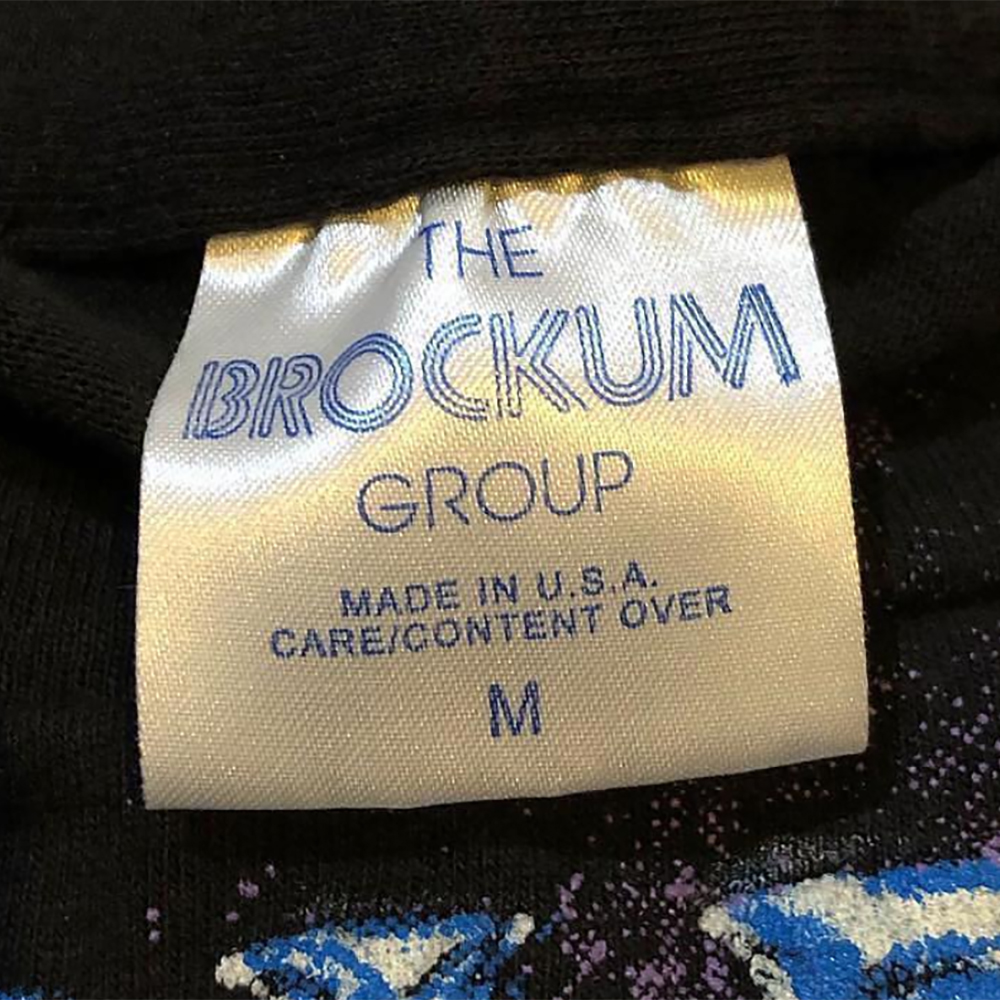
They made a decent stab at this one. The sheen on the tag fabric is on point. But the interwoven pattern on the font in the above example has too much space and is not as tight-knit. Compare the differences between the R’s in “GROUP” and the text below it isn’t a great match. The true version’s text looks to be in a bolded font.
The biggest giveaway is the ample space between the O and the C.
Authentic Vintage The Brockum Group T-Shirt Tag
Follow this link for more examples of genuine The Brockum Group tags. You can also get a complete history and timeline of Brockum tags.
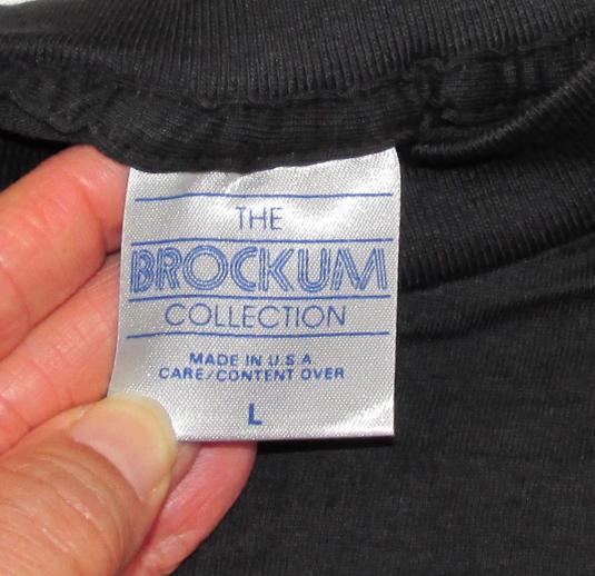
Fake The Brockum Collection T-Shirt Tag
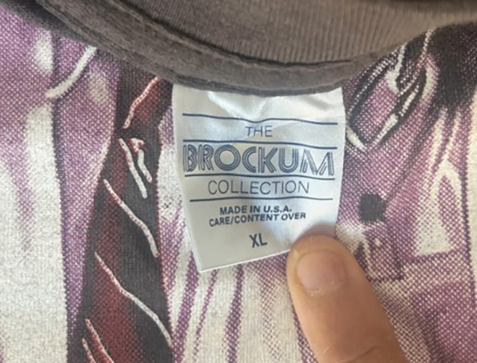
We don’t need to go much further on this until now, because the silver sheen is missing. The photograph isn’t great, but likely the light blue color isn’t correct either.
Authentic Vintage The Brockum Collection T-Shirt Tag
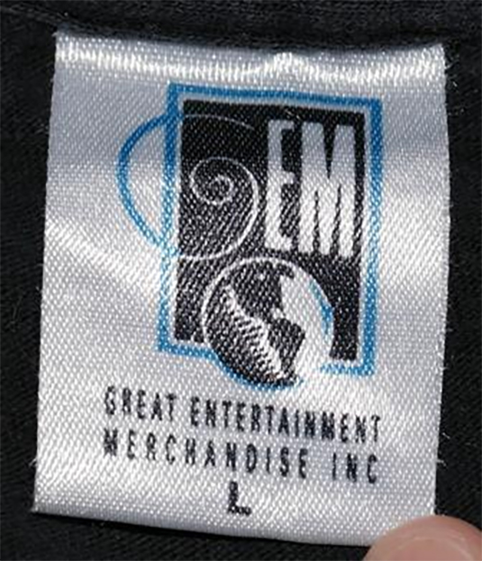
Fake GEM T-Shirt Tag
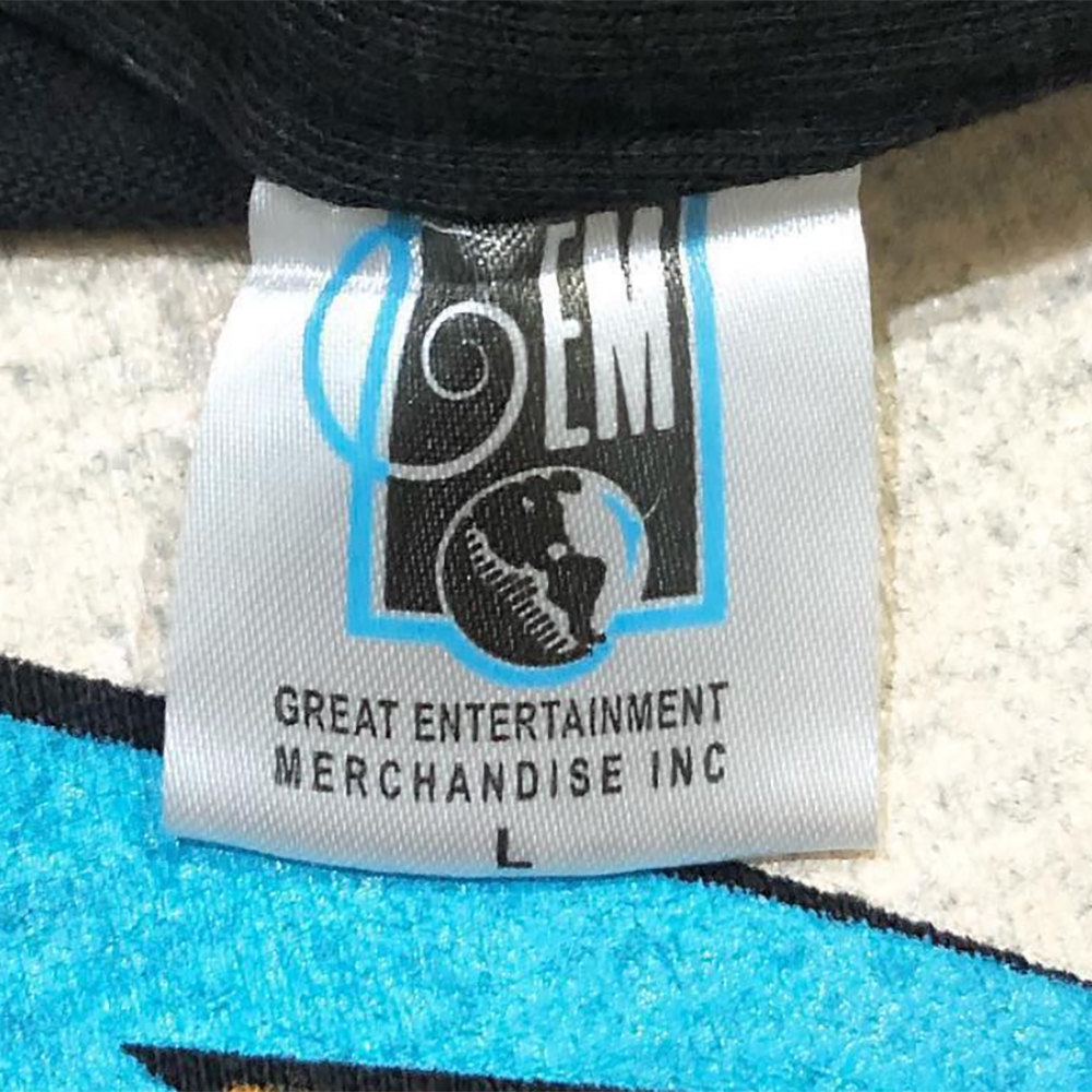
This one also suffers from the same issue the Wild Oats tag does – the branding ends up under the hem – the top border isn’t visible. But I’ve seen the odd legit tag with this issue. Overall, this one is pretty decent, you could argue the blue color is too day glow. The swirl on the G is too thick. The font below isn’t a great match. But the fatal mistake they made was to fill in the missing blue border on the bottom of the globe.
On the true one below you’ll see the border on the bottom right is broken, there’s a gap on the true version.
Authentic Vintage GEM T-Shirt Tag
Follow this link for more examples of genuine GEM tags.
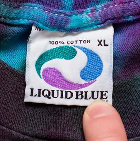
Fake Liquid Blue T-Shirt Tags
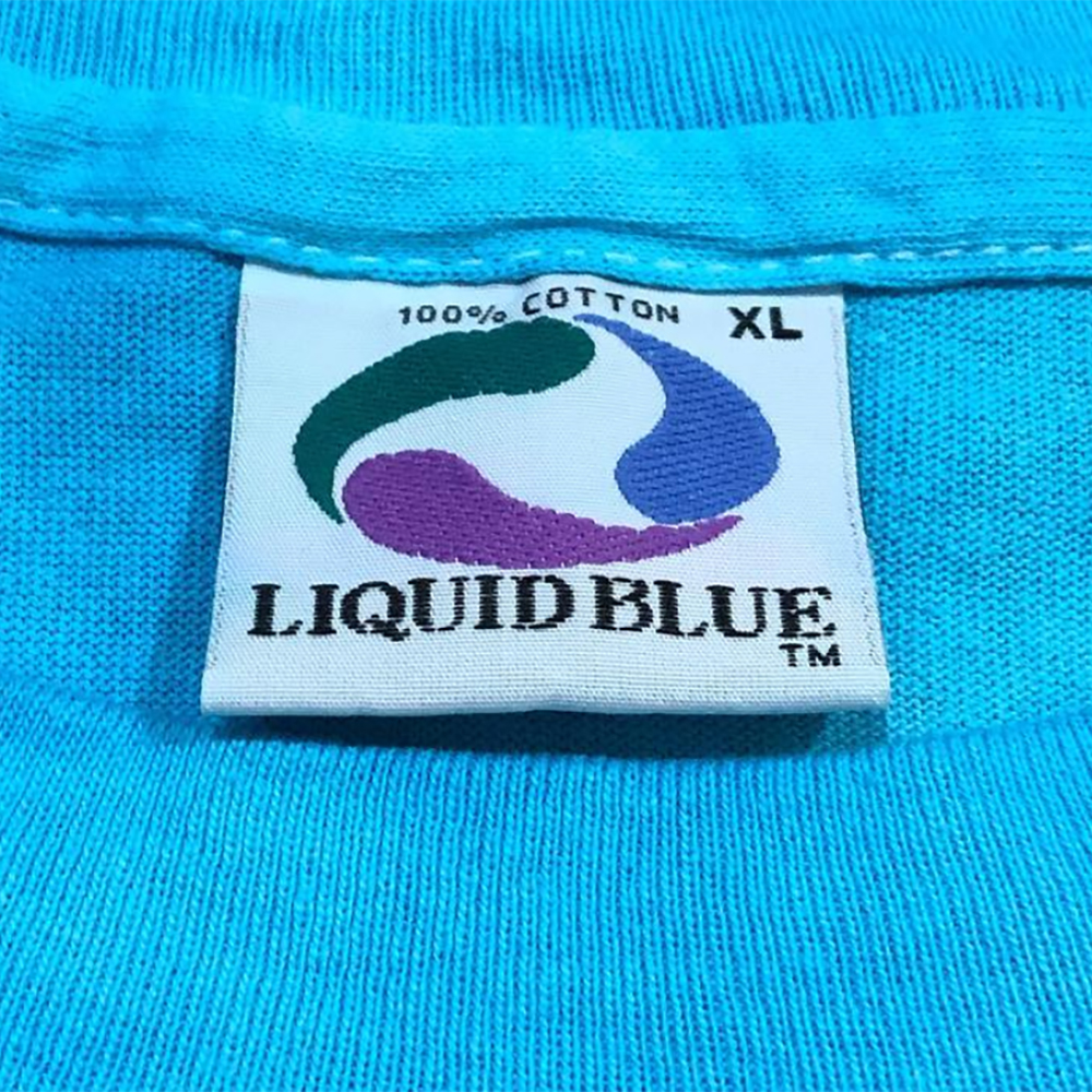
This one is pretty good. Though, their color selection is off – made obvious by the fact that the pattern formed inside each swirl isn’t as visible. Also, it looks as though each swirl on the fake one has a distinguishable border around it. Zoom in on the blue swirl.
The Liquid Blue font is pretty decent, but you can still see some differences, especially the thread count.
The improved version does a better job of nailing the colors, but you can still see an outline border around the drops.
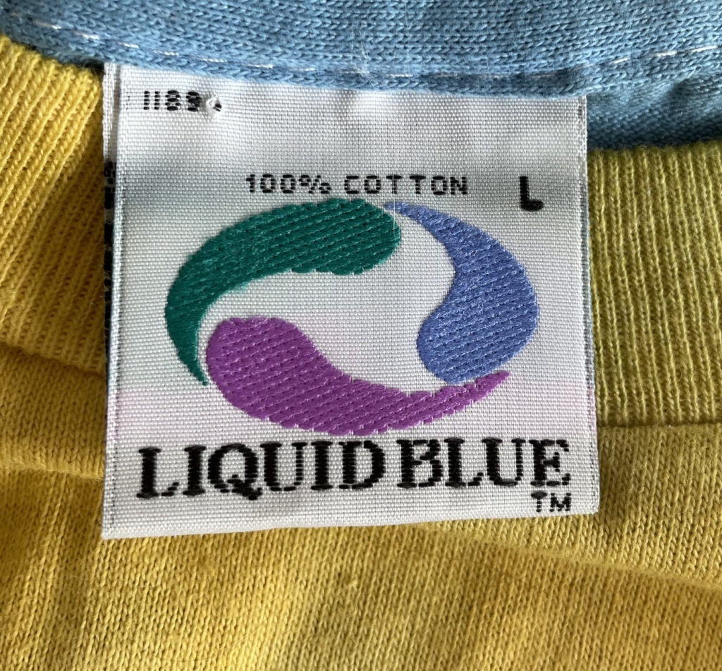
Authentic Vintage Liquid Blue T-Shirt Tag
Follow this link for more examples of genuine Liquid Blue tags.
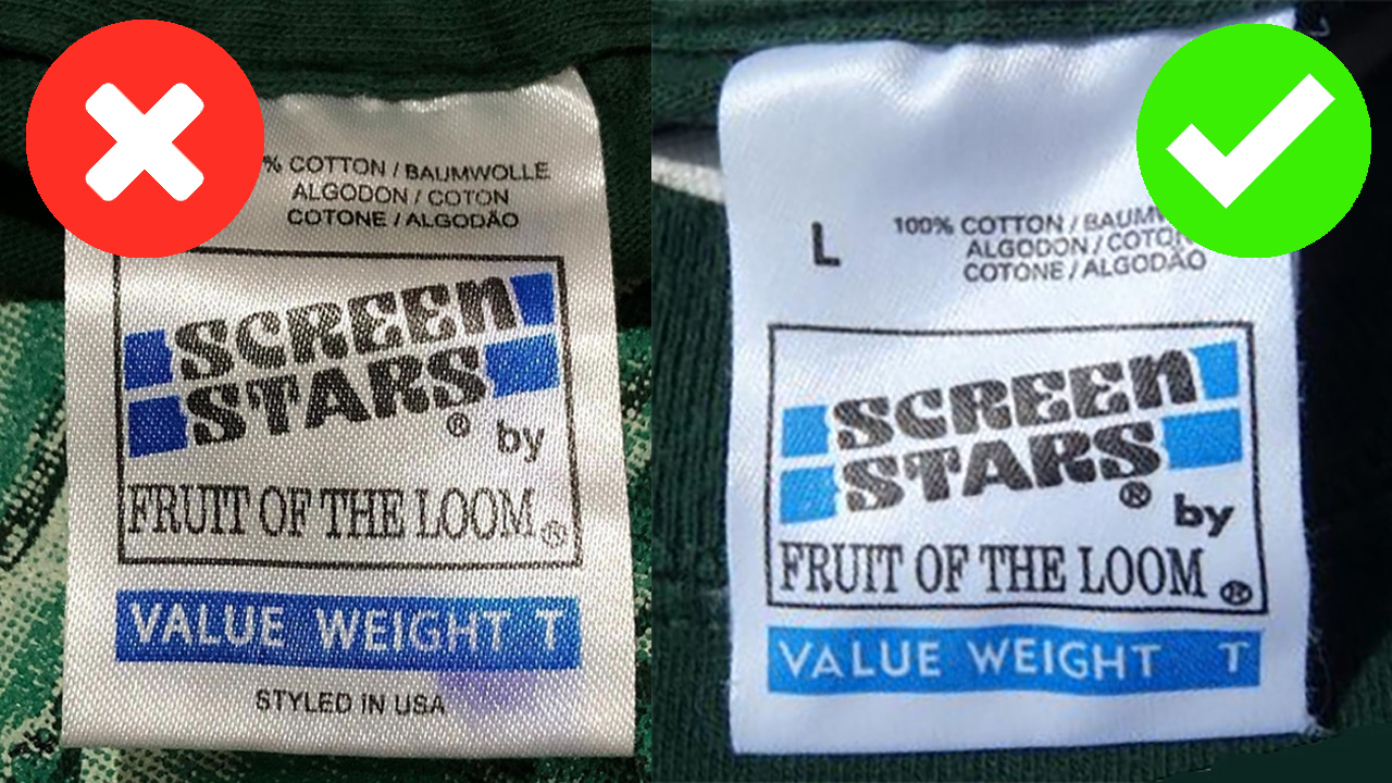
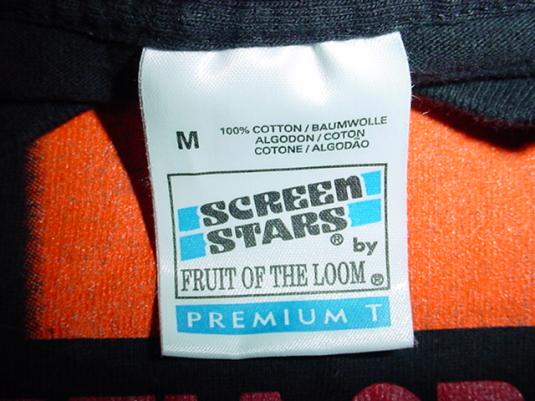
Fake Screen Stars by FOTL Value Weight T-Shirt Tags
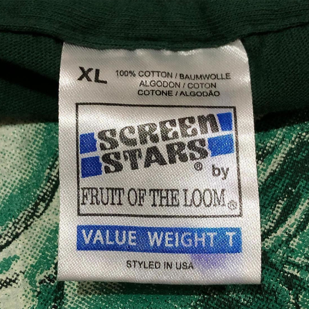
Lots of small differences here. The blue is slightly too dark, though I have noticed some inconsistencies in this regard between genuine tags. The box around Screen Stars is more of a square than a rectangle. Subtle differences in the SS logo. The font for “by” is incorrect. “Value Weight T” is spaced incorrectly.
Then, along came an improved version, with more accurate color, but still with most of the other issues.
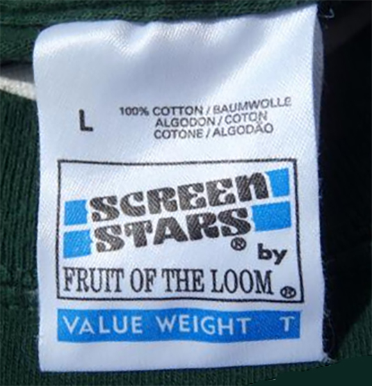
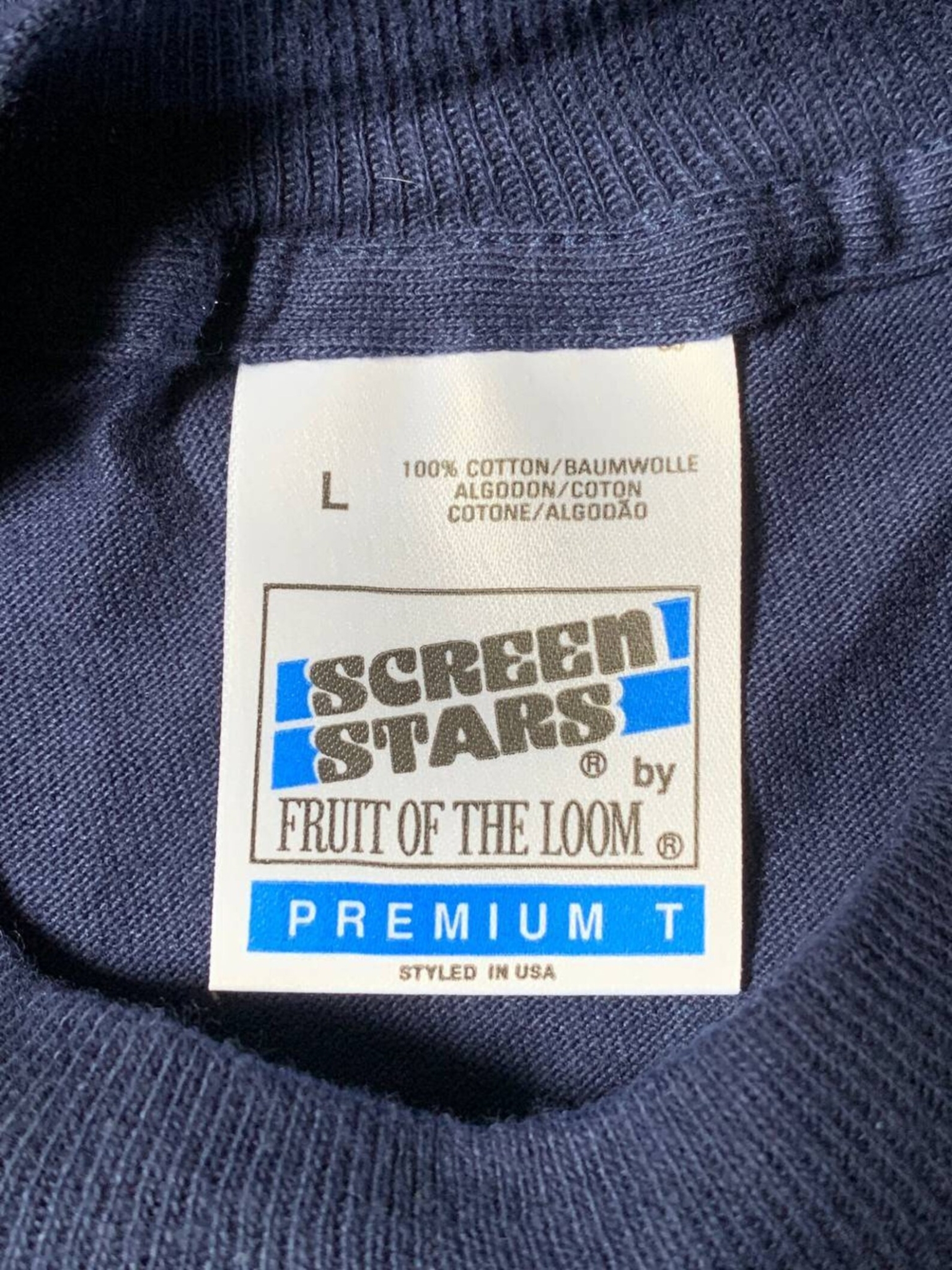
Authentic Vintage Screen Stars By FOTL Value Weight T-Shirt Tag
Aside from the decent Screen Stars logo, the “PREMIUM T” font is different than what we are used to. But the “Premium T” blue bar tag is fairly obscure, to begin with. We managed to find another similar version below, with the same font for “PREMIUM T.” But there are still several differences between them, which could be organic in nature. Remember, tags put out by these companies all had organic differences.
Authentic Screen Stars by FOTL Premium T-Shirt Tags
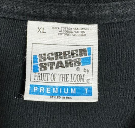
Currently, no fake version of this tag exists. The one above initially caused concern due to a few inconsistencies, like the F touching the blue, but we have since cleared it as an organic inconsistency thanks to the community and IG user gary_player.
Follow this link for more examples of genuine Screen Stars by Fruit of the Loom tags.
Fake Vintage Tultex Tag
This is another convincing fake tag when not directly compared side by side. The spacing between the TULTEX letters is the main giveaway. TULTEX should be more cramped and this is very common across the various tags I examined. There does seem to be some exceptions to this rule, where there’s more space between the letters, but it’s never the amount as shown above.
Then came the improved color version, with the same spacing issues and an uncentered “X-Large.”
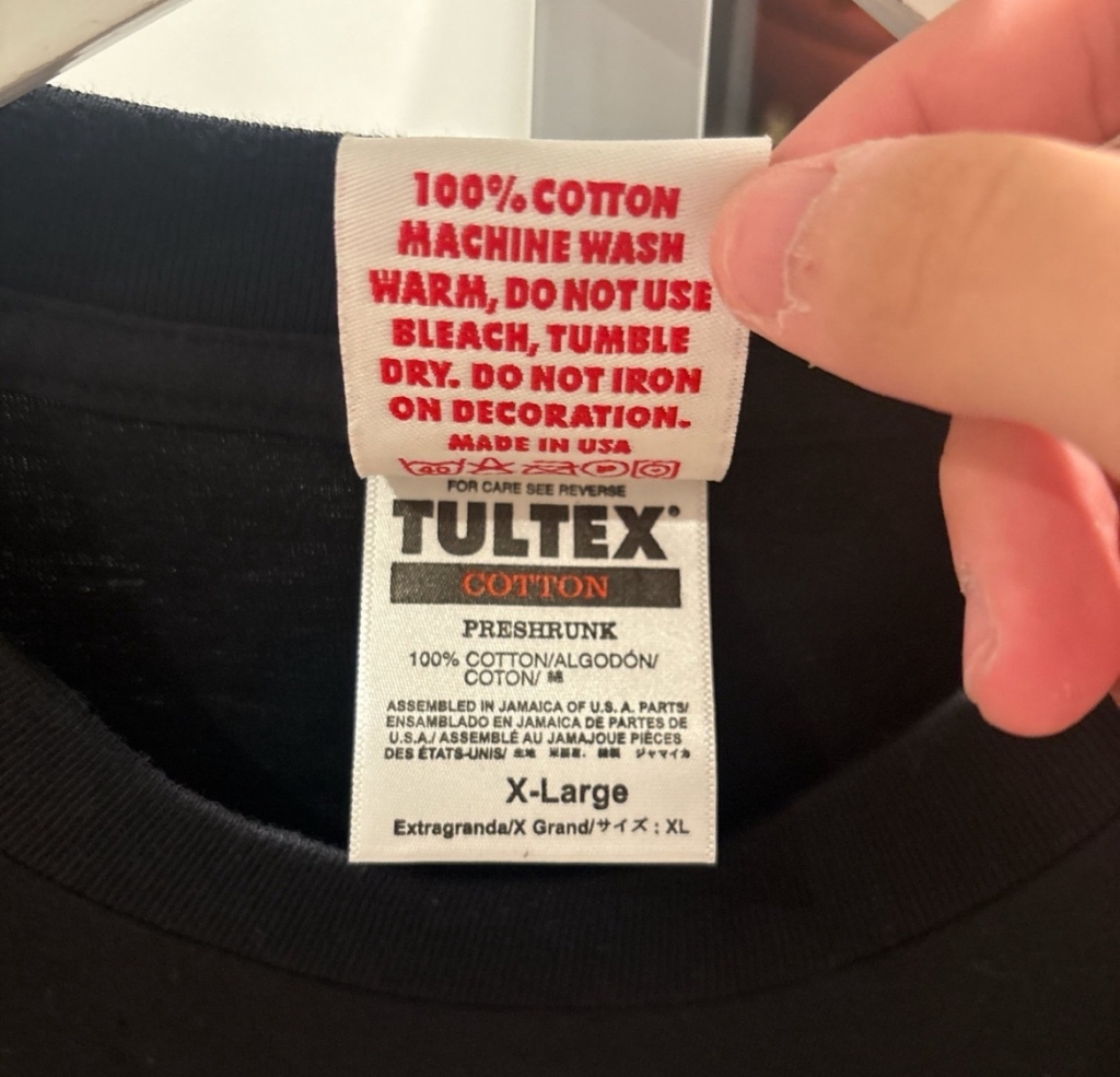
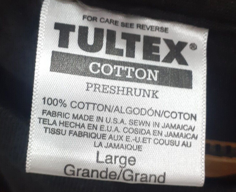
Authentic Vintage Tultex T-Shirt Tags
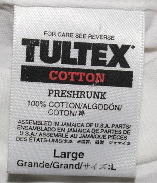
Below is a legit version of the tag where the letters are spaced out more than usual, but still not as much distance as the fake tag above.
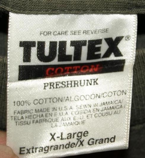
By the way, it’s completely normal for the legit versions of this tag to have some interesting transformations to the “COTTON” black bar after some wear and washes.
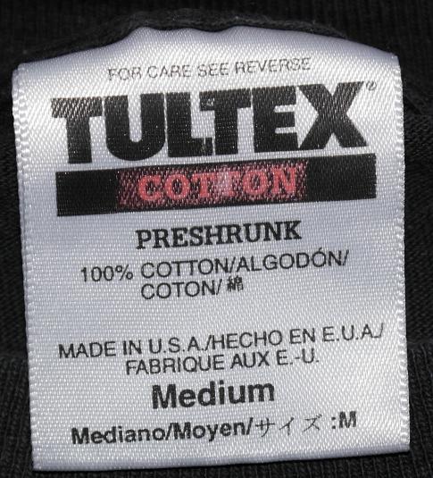

Follow this link for more examples of genuine Tultex tags.
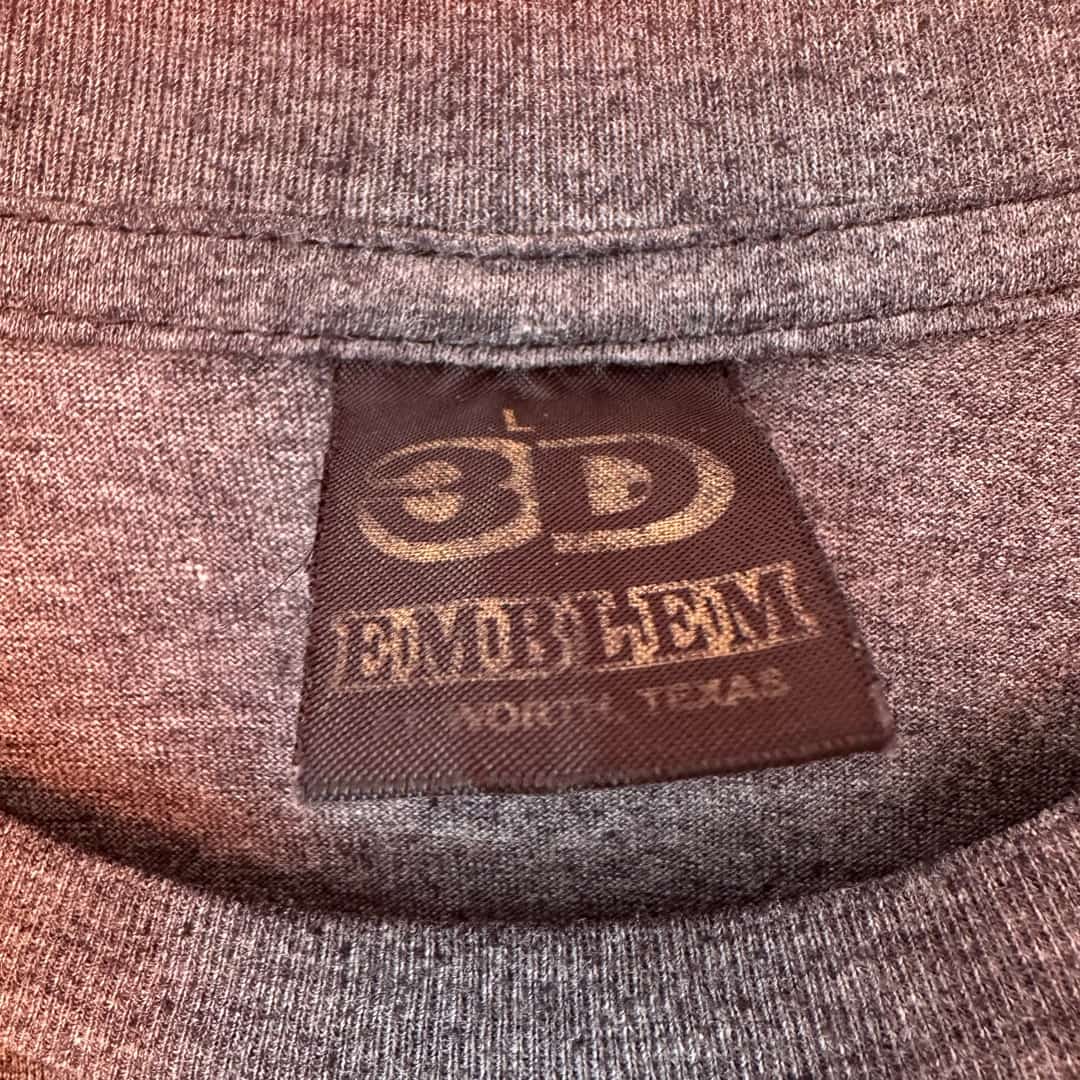
Fake 3D Emblem T-Shirt Tag Version 1
The material and edges of the tag are convincing. But the 3D effect is lost in the fake version. The font for the size is too thick. The 3 and D don’t match. The “Emblem” font is wrong. This fake tag also features the design being partially buried under the flap. Other than everything, it’s perfect!
Fake 3D Emblem T-Shirt Tag Version 2
This one is pretty sloppy too. The shadow effect isn’t achieved. The 3 and D are cramped. The size is strangely positioned.
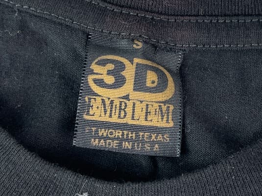
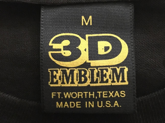
Authentic 3D Emblem T-Shirt Tag
Follow this link for more examples of genuine 3D Emblem tags.
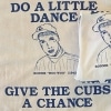
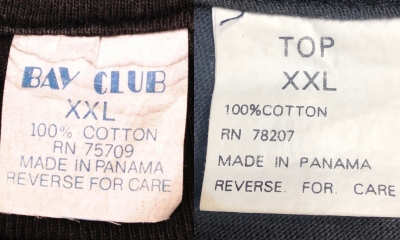
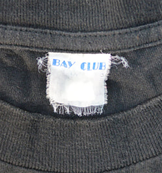
Fake Bay Club T-Shirt Tag
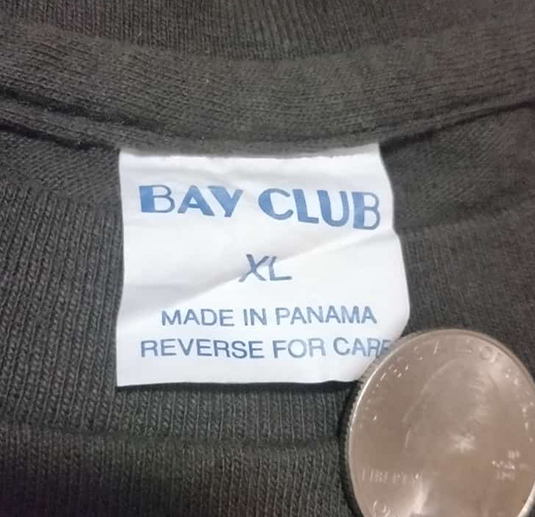
When there are fakes being made of bootleg t-shirts, and the brands most commonly associated with bootlegs, you know the vintage t-shirt market is hot. There’s more than one flub, when you examine these Bay Club tags. They didn’t exactly nail the unique logo very well, and it’s missing half of the information on a real one. The real ones fade like crazy after a handful of washes, and also fray along the edges.
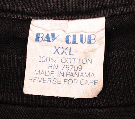
Authentic Bay Club T-Shirt Tags
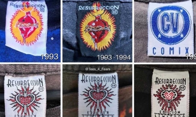
Fake Resurreccion T-Shirt Tag
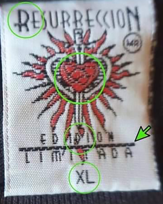
@Tees_4_fears has graciously donated his analysis for this guide. Lots of discrepancies here, but it’s such a busy tag that the multiple issues might fly under the radar. The R and the detail within the heart are always the biggest red flags.
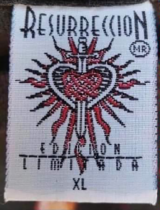
Real Resurreccion T-Shirt Tag
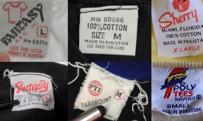
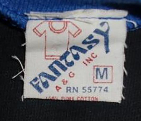
Fake Fantasy T-Shirt Tag
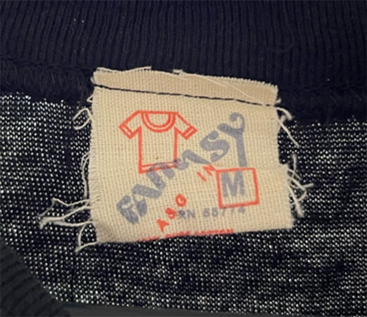
Ten years ago I would have never imagined that a low-cost, poor-quality blank, used by bootleggers would have fake versions. But here we are. The dead giveaway here is how the bottom of the red t-shirt outline is visible through the Fantasy font. But the material the tag is on and even the basic construction of the t-shirt, is kinda impressive.
There are multiple Fantasy tag designs you can see here – but this appears to be the only one targeted thus far.
Authentic Fantasy T-Shirt Tag
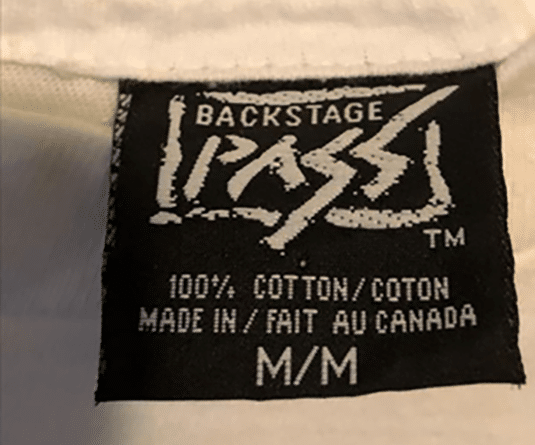
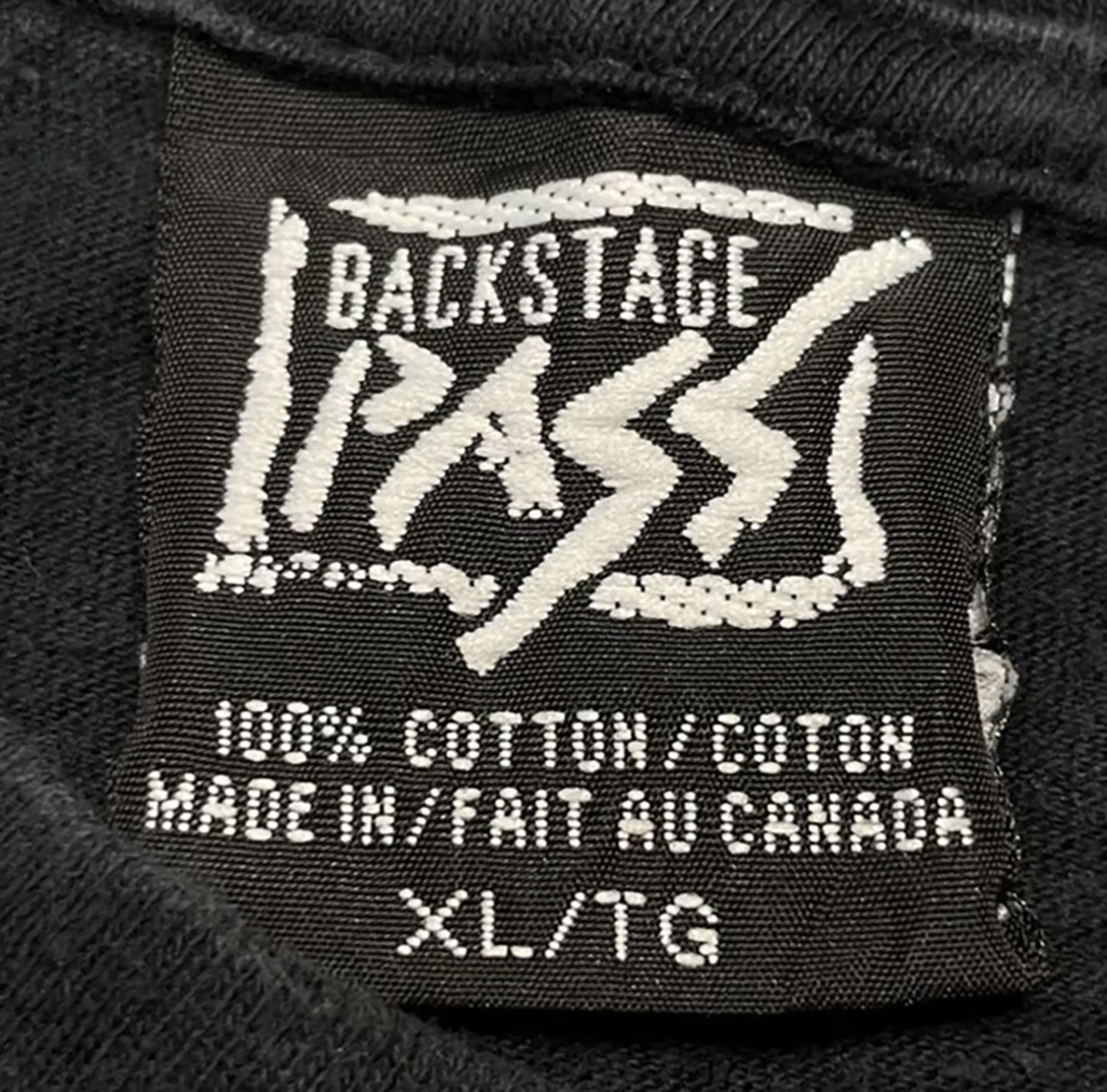
Fake Backstage Pass T-Shirt Tag
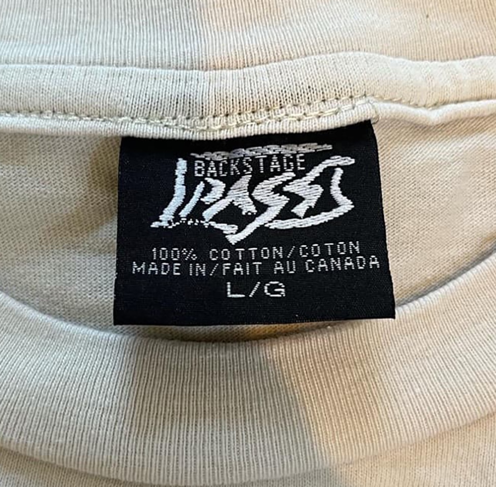
Lots of differences here. Look how the S breaks from the right border. All the letters PASS letters are slightly off. The spacing is off. It’s missing the “TM.” (BUT there are also legit BSP tags with no TM, see below.)
Btw, the one above was a fake tag that was sewn in.
Real Backstage Pass T-Shirt Tags
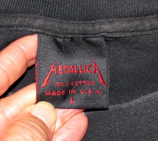
Fake Metallica T-Shirt Tags
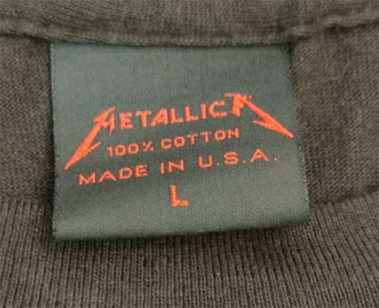
This one is pretty good to the naked eye, and if you’ve assumed there aren’t any fake Metallica tags, it may fool someone. I haven’t seen one in person, but the material of the tag doesn’t seem correct. The letters of the Metallica logo are off – they aren’t as tall – the C is what seems to be the most obvious. In the real version, it’s more of a half-circle. The “A” in made also obviously off.
Then along came the one below, which, if you’re assuming it is fine because the C is more accurate, it might fool you.
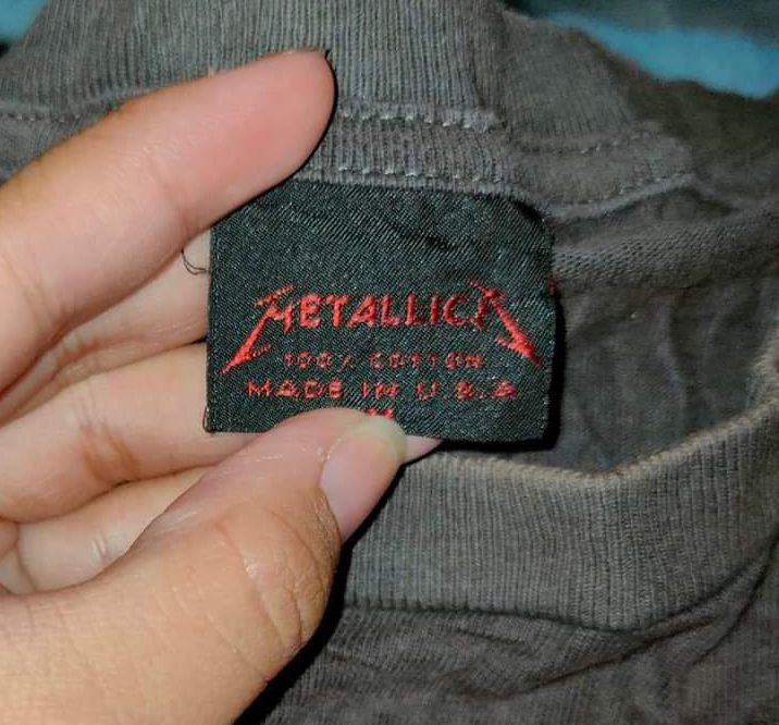
Below is the latest generation of fake Metallica tags with a whole host of problems. Compare the stylized M and A to the real one, and it will become clear. The text below the logo is also too bold, focus on the A’s in the MADE IN U.S.A. line and you’ll notice the horizontal line isn’t low enough, and so on…
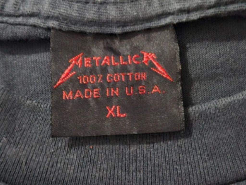
Real Metallica T-Shirt Tag
Follow this link for more Genuine Metallica T-Shirt tags.
Fake Spring Ford T-Shirt Tag
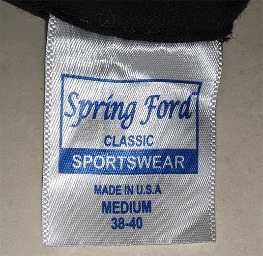
The forgery above is using a different font, it’s a script/handwriting font that’s connected in some parts. Compare each letter individually and the whole thing is obviously incorrect. Plus they forgot the period after U.S.A.
Authentic Spring Ford T-Shirt Tag
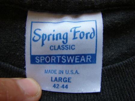
Follow this link for more Genuine Spring Ford T-Shirt tags.
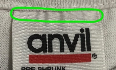
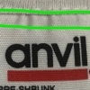
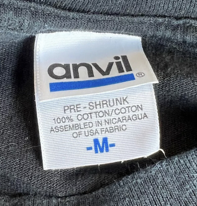
Fake Anvil Blue Bar Nicaragua Tag
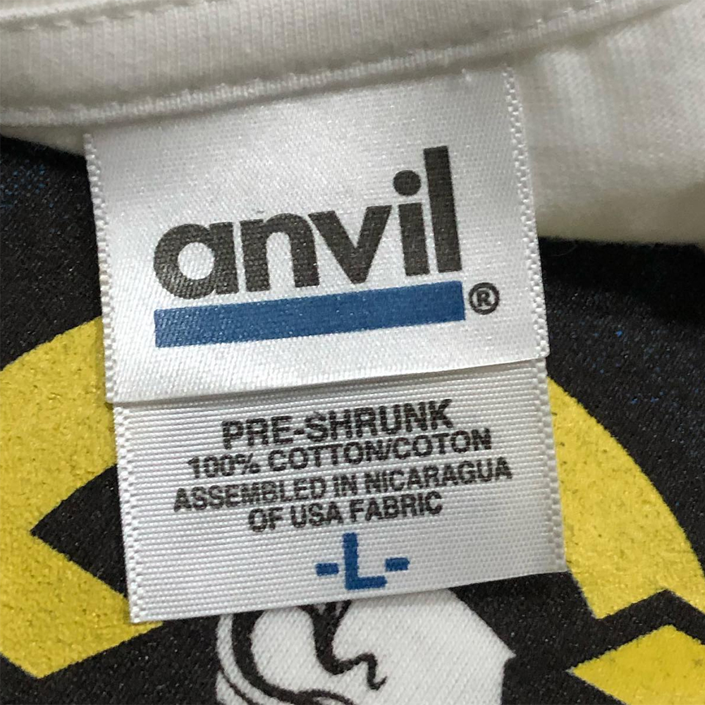
The Nicaragua Anvil tags came to be around 2004. So if you’ve got this tag on a t-shirt from prior to that date, it’s a red flag. You’ll notice the fake has a dull blue color as well as a bolded font below the bar. The Anvil font looks to be slightly too thick for this blue bar version (it matches the font on the red bar better.)
The deadest giveaway is the height of the L – it should generally line up with the dot on top of the i, and that’s standard across all Anvil tags. On this fake one, the L is way too high.
Check out this Anvil History for more examples of authentic tags.
Authentic Anvil Blue Bar Nicaragua Tag
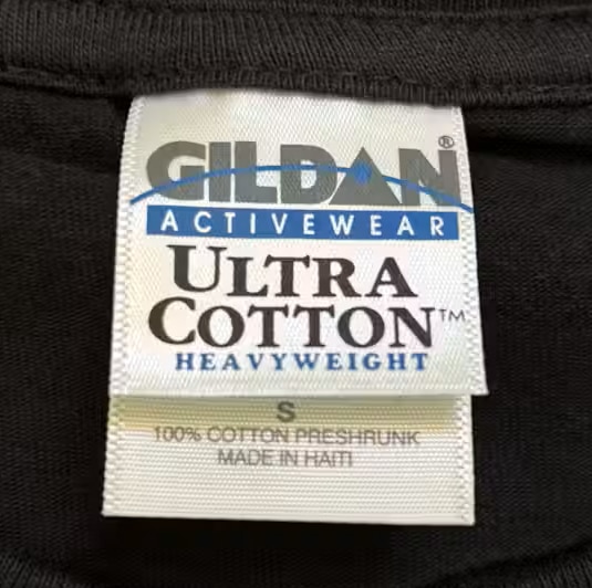
Fake Gildan Ultra Cotton T-Shirts
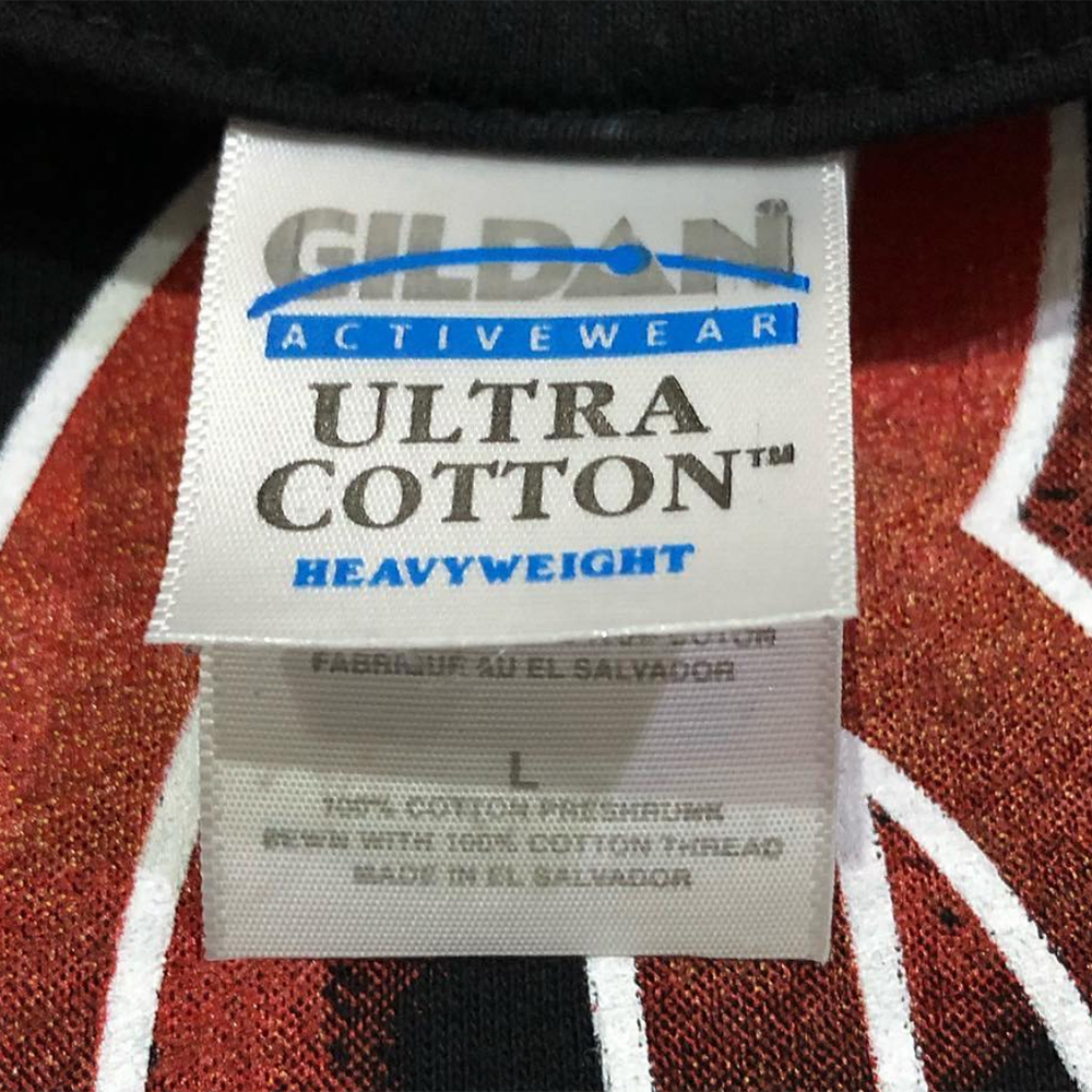
I can’t believe we’re in an era where Gildan double tags are being counterfeited. There are lots of subtle differences here – the placement of the circle inside the A, the “activewear” font inside the blue bar, the details on the under tag, the real tag’s design takes up more real estate, etc, etc.
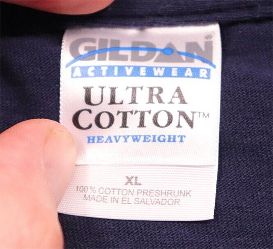
Then there’s the one below, where the U from Ultra is elevated. All the letters are too close, and look at the font in the blue bar – as well as the fact that the A & C have too much space between them.
It all becomes obvious when you compare these two to the one below.
Authentic Gildan Heavyweight T-Shirt Tag
Fake Gildan Heavy Weight Cotton T-Shirt Tag
Looks like the bootleggers got creative here and added a shading effect to the blue line that passes through the logo. That line is also too thick and you can see it improperly cuts off the entire bottom tip of the N.
Authentic Gildan Heavyweight T-Shirt Tag
Fake All Sport Proweight T-Shirt Tags
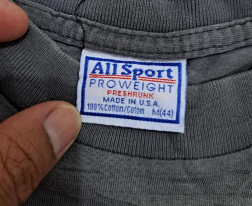
We previously had this one on our list to monitor, but it’s now confirmed. Two variants of this fake tag have both been attached to a confirmed fake. Further, M(44) doesn’t make sense—it is always M(40) in the All Sport line, and I have yet to find a legit match with this tag.
I was hoping it was a rare manufacturing error, because aside from the size error, it’s one of the most impressive counterfeit tags we’ve ever seen.
Then we discovered a second one on another fake NIN tee. Yikes.
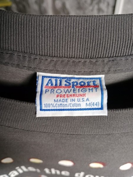
And a third was found on a second-size Goof tag attached to a fake NIN tee. It should be L (44)
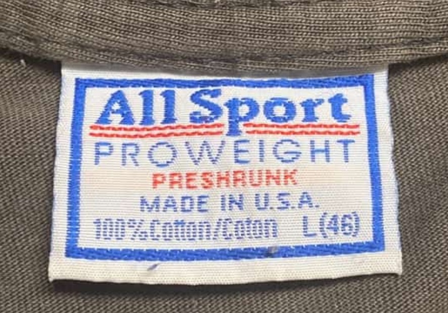
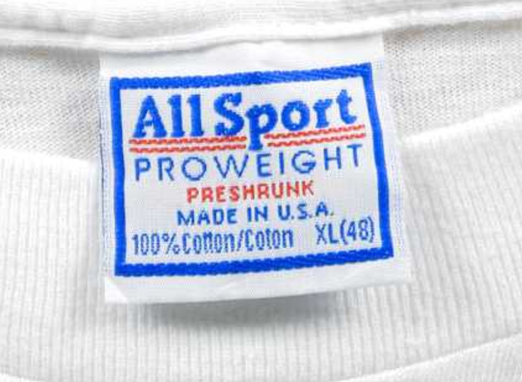
Real All Sport Proweight T-Shirt Tag
Fake Alstyle Apparel & Activewear T-Shirt Tag
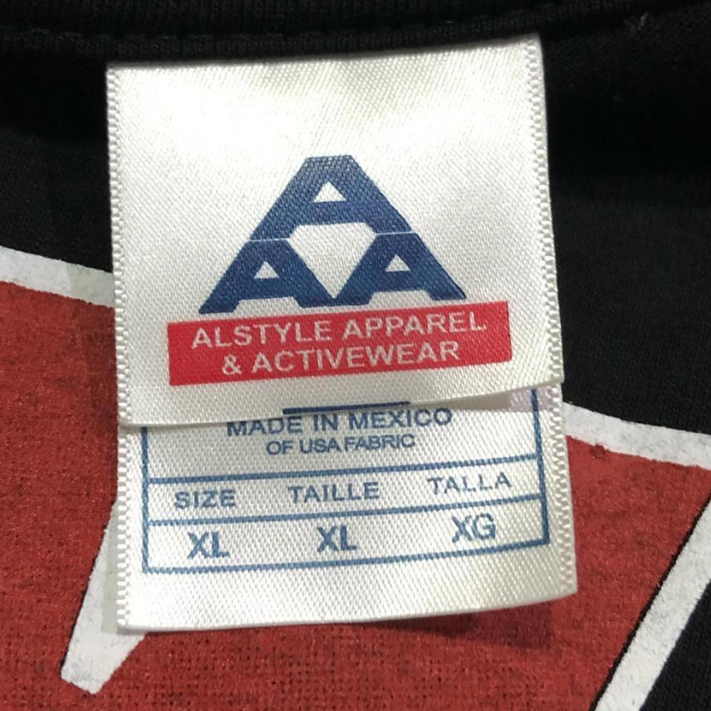
That line at the bottom of the fake tag, shouldn’t be there. The top A, doesn’t have enough space under it. The fonts, font weight, and spacing used in the under tag aren’t a great match.
Authentic Alstyle Apparel & Activewear T-Shirt Tag
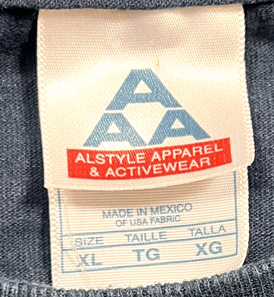
Here’s more legit Alstyle tags.
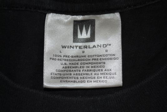
Fake Winterland T-Shirt Tag Version 1
The first fake Winterland tags are too tall. The box around the “W”/Crown is also too tall – the W should be mostly centered. They also made them too silvery. The TM symbol is too low. The spacing (leading) between the lines is too generous, and the bottom line from the real tag, “Esamblado En Mexico” is absent.
Fake Winterland T-Shirt Tag Version 2
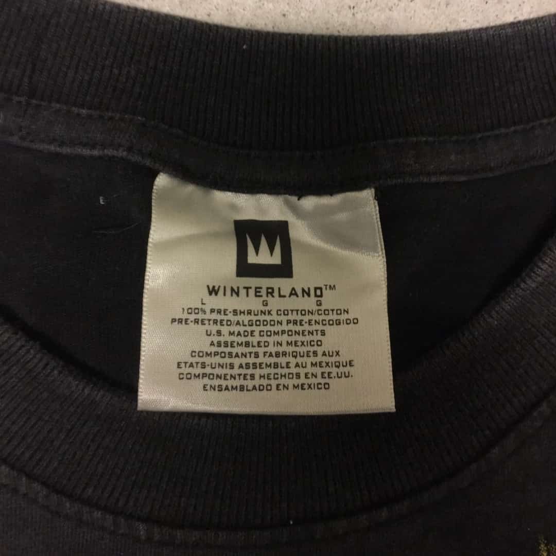
The second version we’ve spotted sports a Winterland logo that’s too tall. Go ahead and compare every letter in the logo and you’ll see it’s off. But it’s the D in Winterland that’s easiest to hone in on – it looks square. It kinda looks like WINTERLANO. Plus, the leading is off – look at how cramped the line with the sizes is – when compared to the one below. One other thing to note – the fake says “PRE-RETRED” whereas the original reads, “PRE-RETREC”
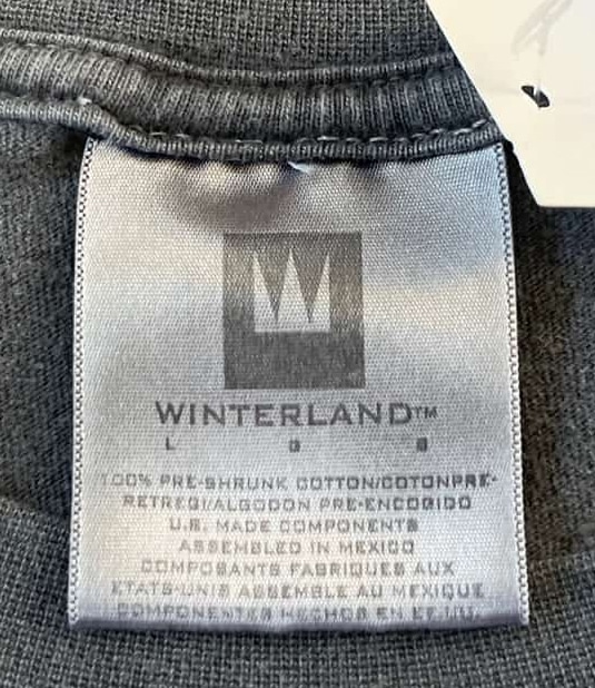
Authentic Winterland T-Shirt Tag
We’ve got ton of other legit Winterland tags and have a full history of the brand.
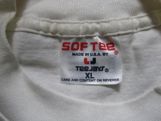
Fake Sof Tee by Tee Jays T-Shirt Tag
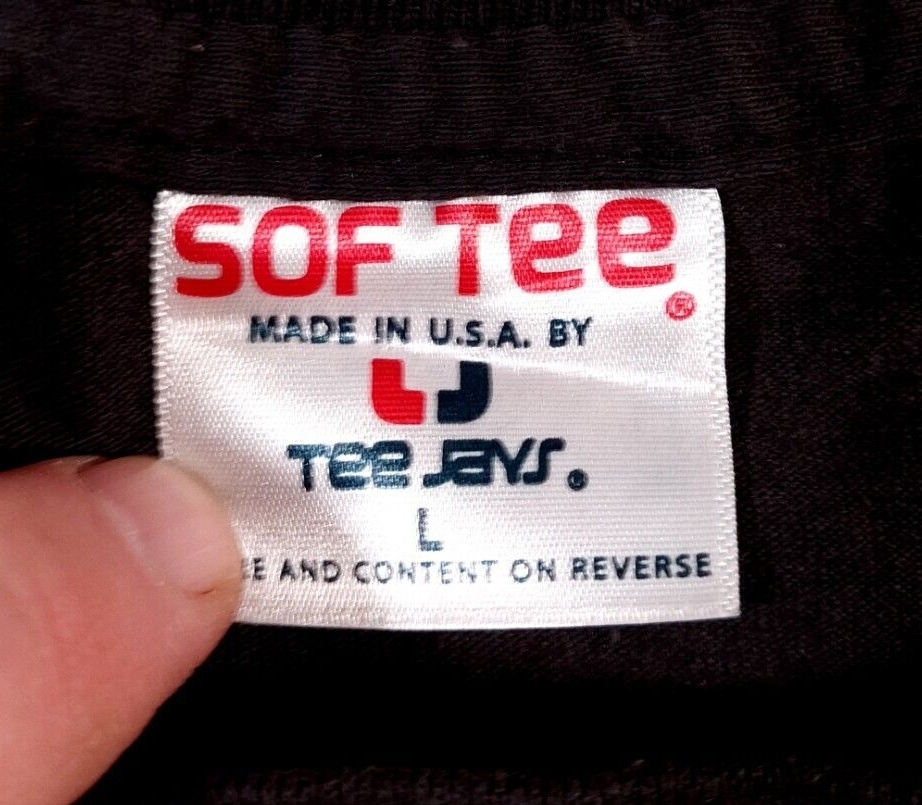
At first glance, not bad. But when compared to the legit version – the main font is incorrect. It’s too tall, the corners are too rounded. The “O” is the biggest giveaway, it should be more of a square than a rectangle. Interestingly the “Tee Jays” portion is very cramped, especially between the J and A. But after looking through our archives, we did find a legit version with that type of spacing.
Authentic Sof Tee by Tee Jays T-Shirt Tag
Fake Changes T-Shirt Tag
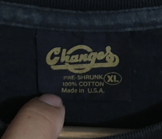
Surprisingly, the counterfeiters went to the extra trouble of printing an undertag, complete with a CA number. Bold move. It might initially help them fool more people, but ultimately, it becomes the most enormous red flag, so expect people to start removing them soon.
The undertag. If it’s present, high chance it’s fake. The fake CHANGES logo is thicker; therefore, it loses some detail in the cursive styling. If it appears to say ‘CHANGOS,’ it’s not right. The size label on the fake is exceptionally thick.
The last letters on each line of text, KNA, are vertically aligned, whereas on a real one, there is a slight angle. (Careful with this one, though, we have found real tags that are aligned too.)
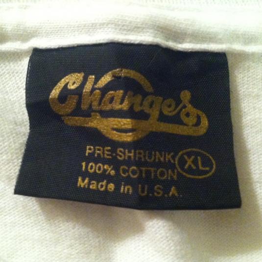
Authentic Changes T-Shirt Tag
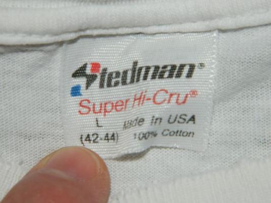
Fake Stedman T-Shirt Tag
Ok, they aren’t even trying anymore. The S logo isn’t bad, but everything else is in the completely wrong font.
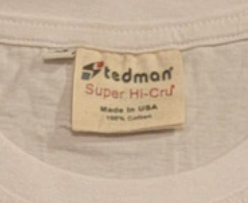
Authentic Stedman T-Shirt Tag
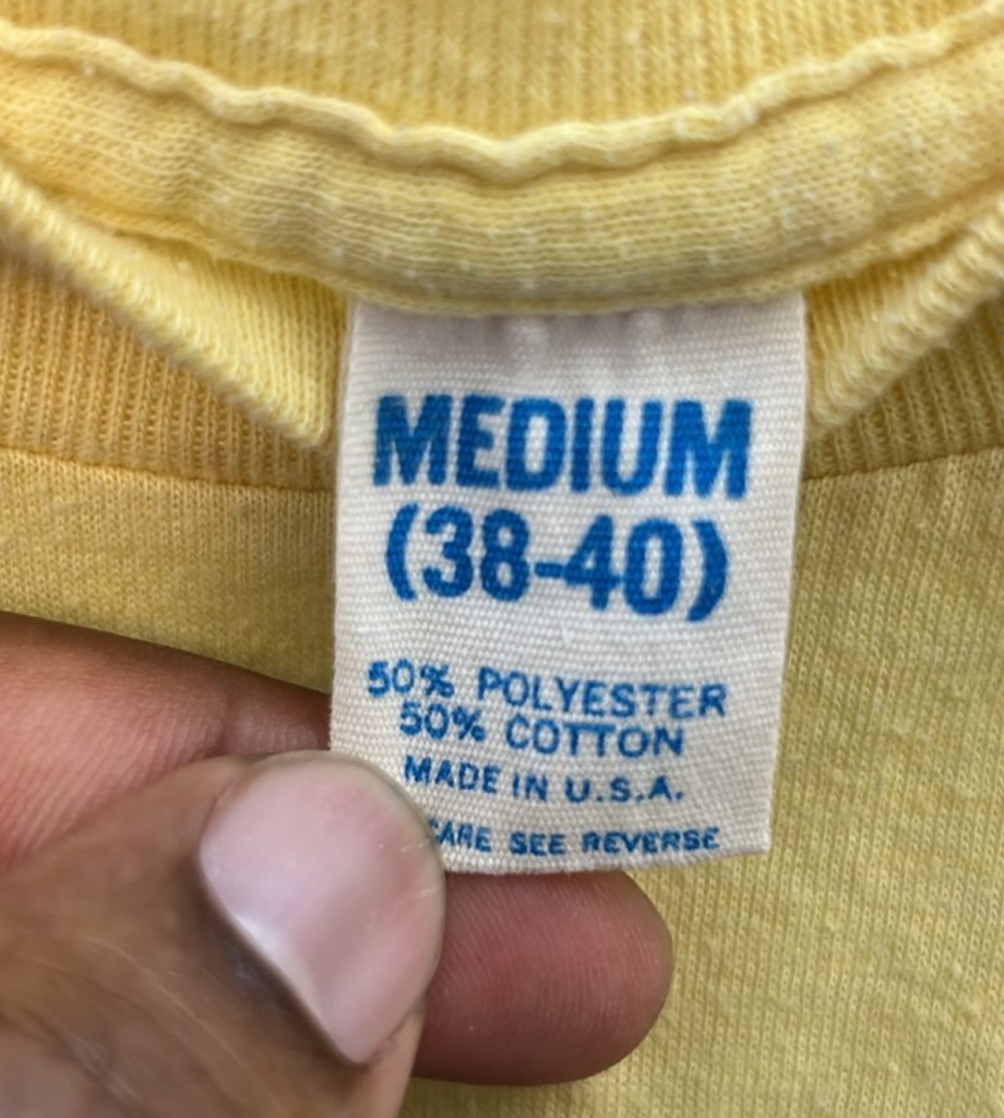
Fake USA-Based Generic T-Shirt Tag
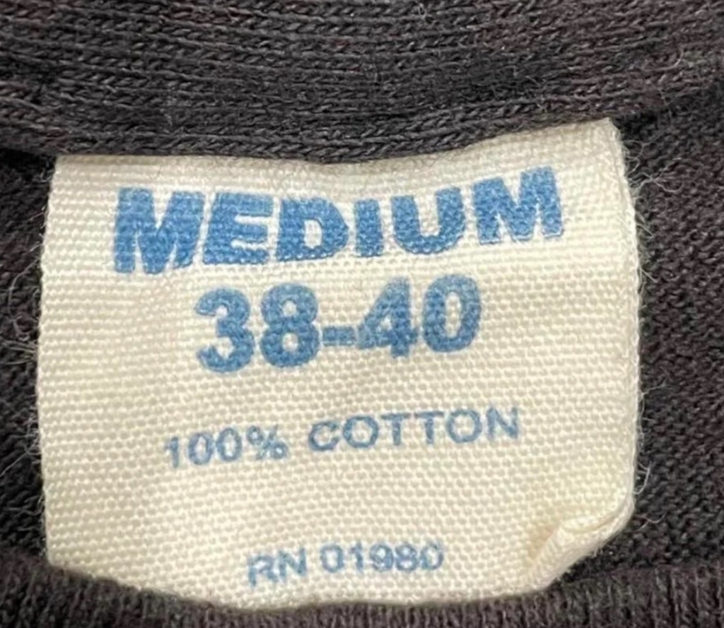
As soon as you see RN 01980, know it’s a modern creation that often shows up on Thailand counterfeit and bootleg 90s prints.
As far as we can tell, there’s only a MEDIUM version of this fake tag. Why is that? Well, according to what we’ve been told, MEDIUM is a preferred vintage size in Thailand.
The back features a WPL 3107 (Wool Products Labelling) number, which has no connection to the garment, nor RN 01980…which they just chose because the 1980s rule!
Authentic USA-Based Generic T-Shirt Tag
To be continued…In the meantime, if you’ve spotted a fake tag out in the wild, please get in touch with us.

James, aka Jimmy J, founded Defunkd 21 years ago, and has been buying, selling, collecting and studying vintage t-shirts ever since. He's had a special interest in authenticity since 2010 when he created the blue print for the t-shirt authentication process. For more, check the history of Defunkd and Jimmy's Expertise.